
FreeRun Menu Project
Results
Drafted paper prototypes, wireframed, and implemented in-engine a complete prototype for a game concept that displays style and design sense.
Team Size
Solo
Tools
Paper, Figma, Unity Engine
Development Period
Begin: September 2025
End: October 2025

Overview
This project was an assigned project for a Design Methods course. I took this as an opportunity to challenge myself and quickly…
Concept
Design
Implement
Test
Iterate
…a fully-featured prototype myself within the given time frame (with time to spare).
Project Goals
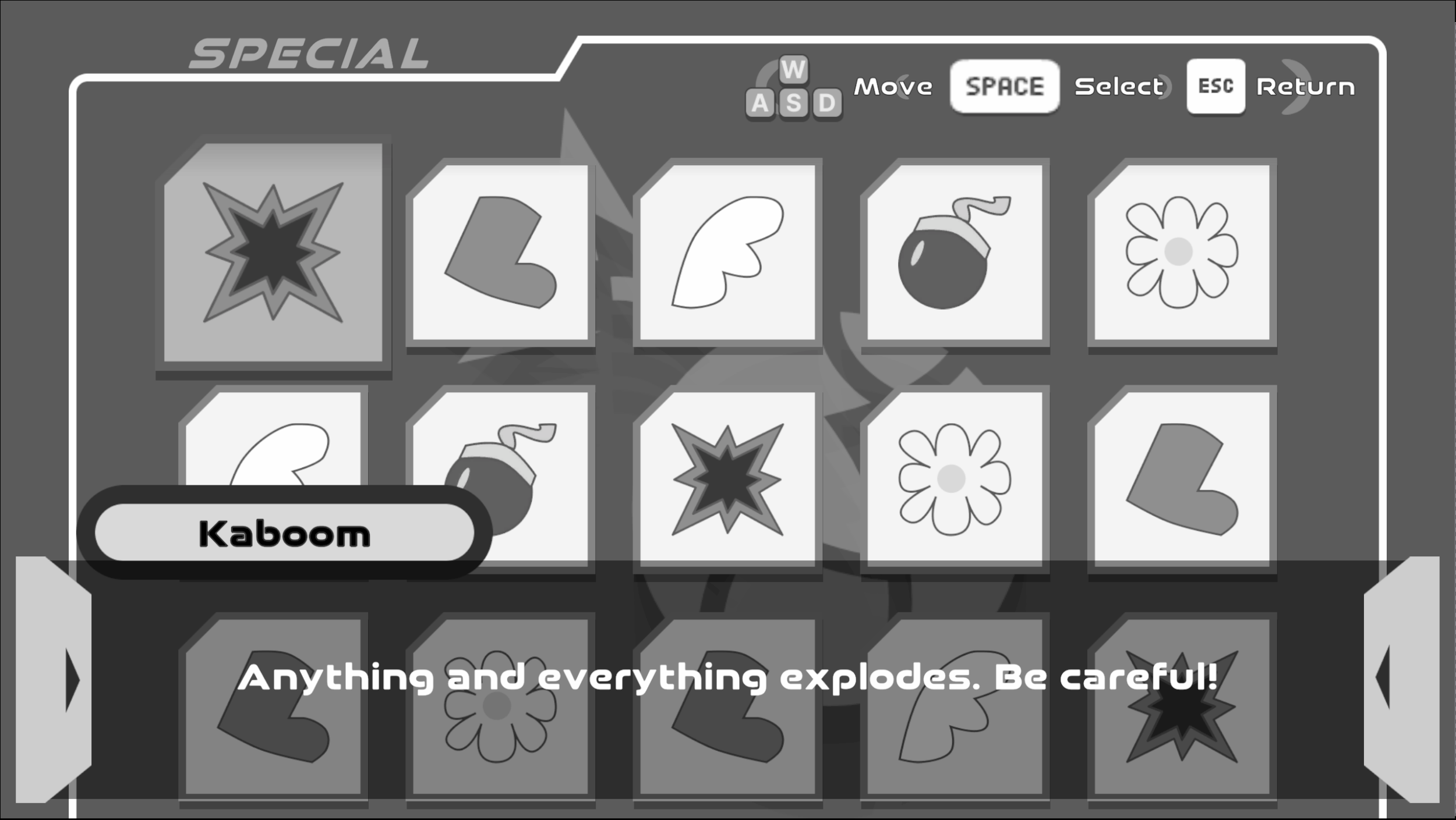
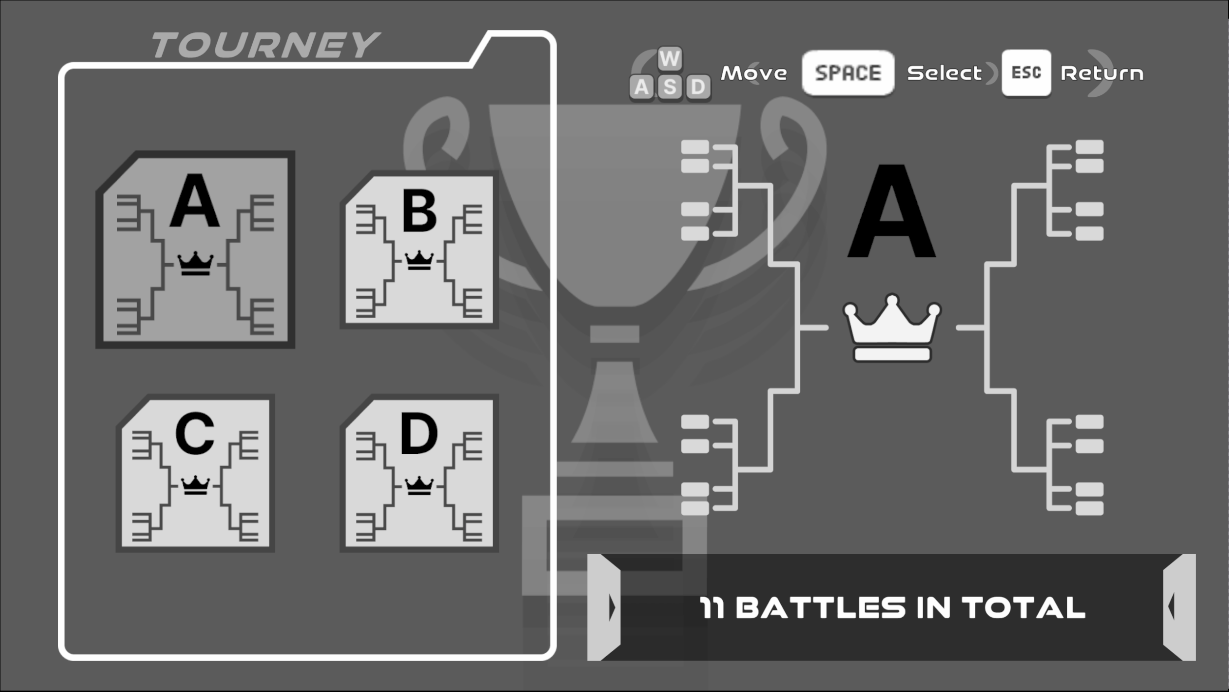
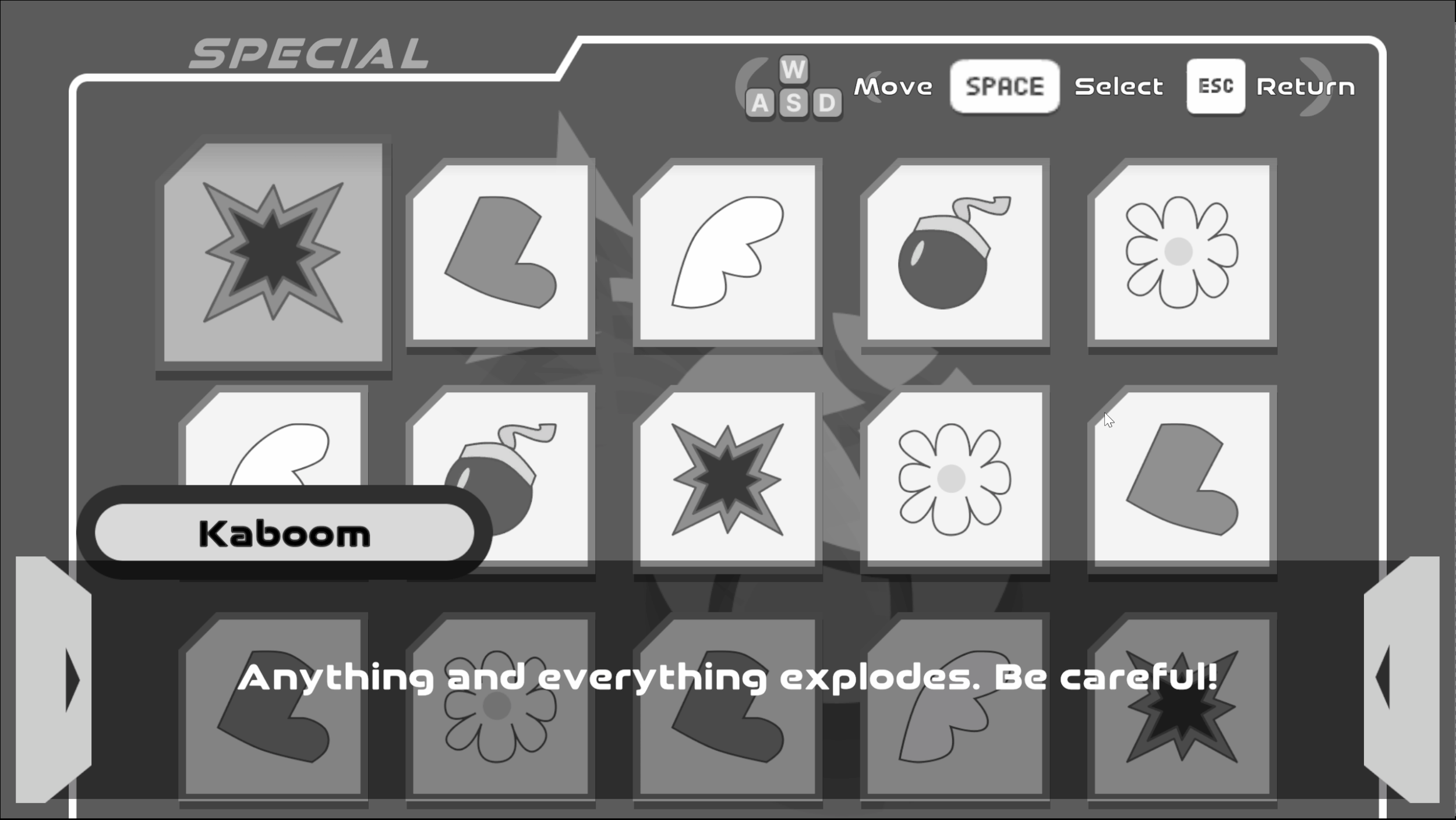
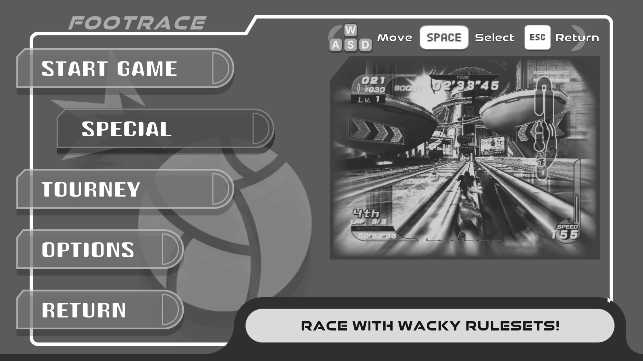
The goal of the project was simple enough: Within 5 weeks, create an interactable User Interface Prototype with a(n)...
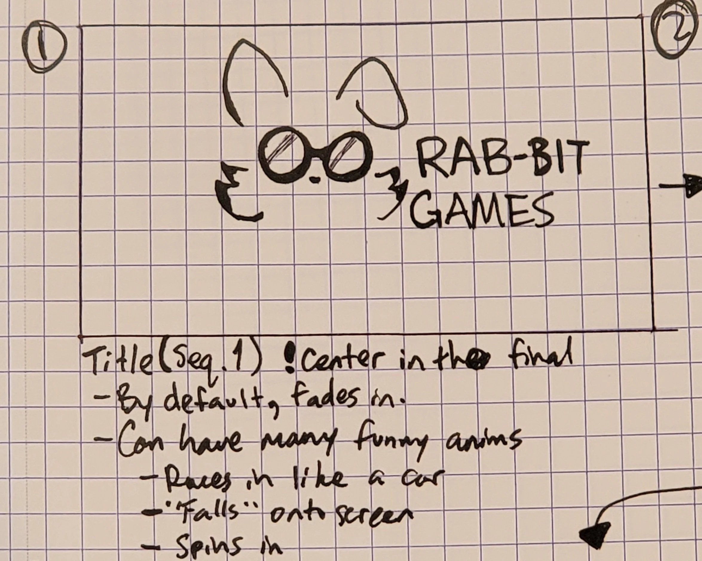
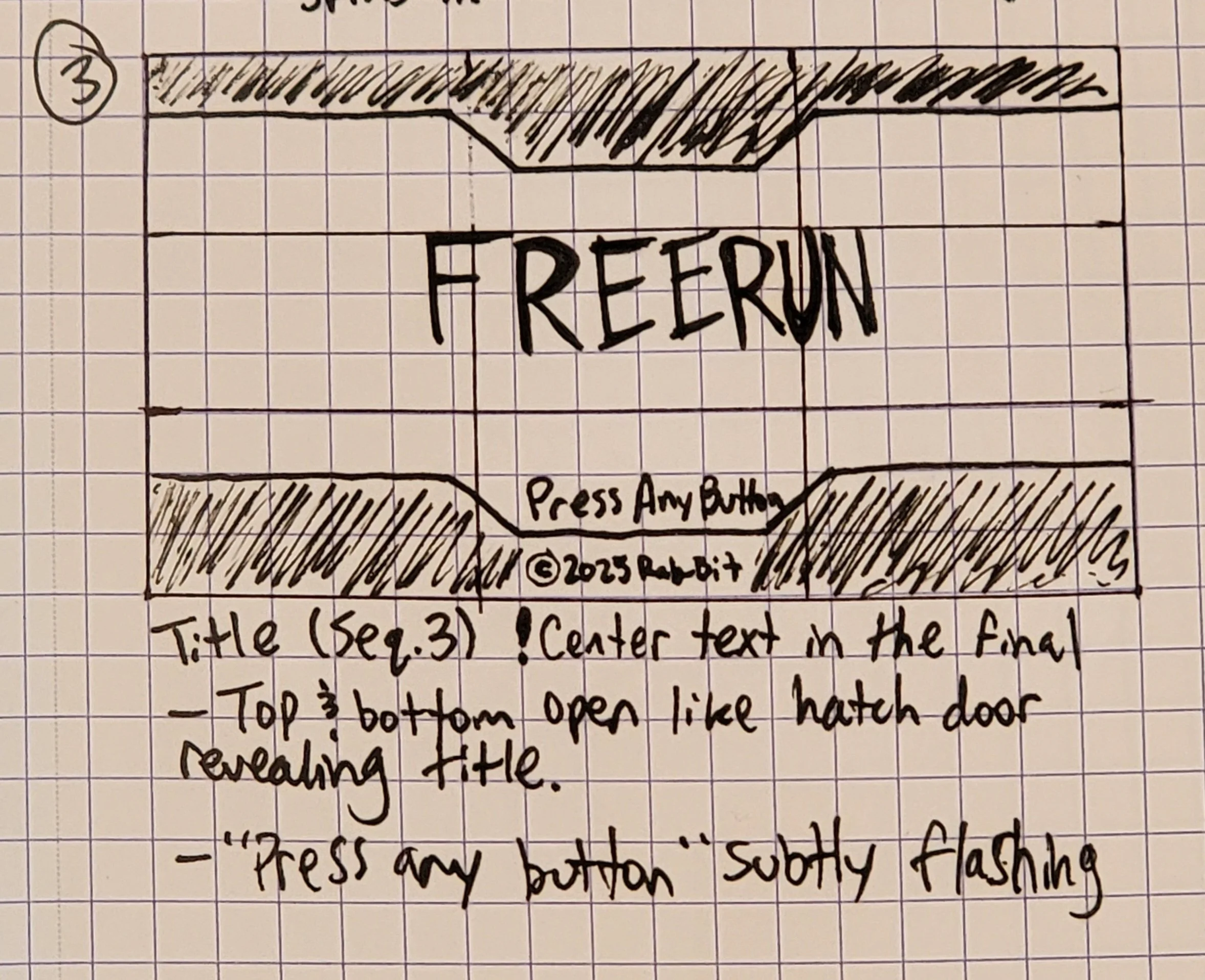
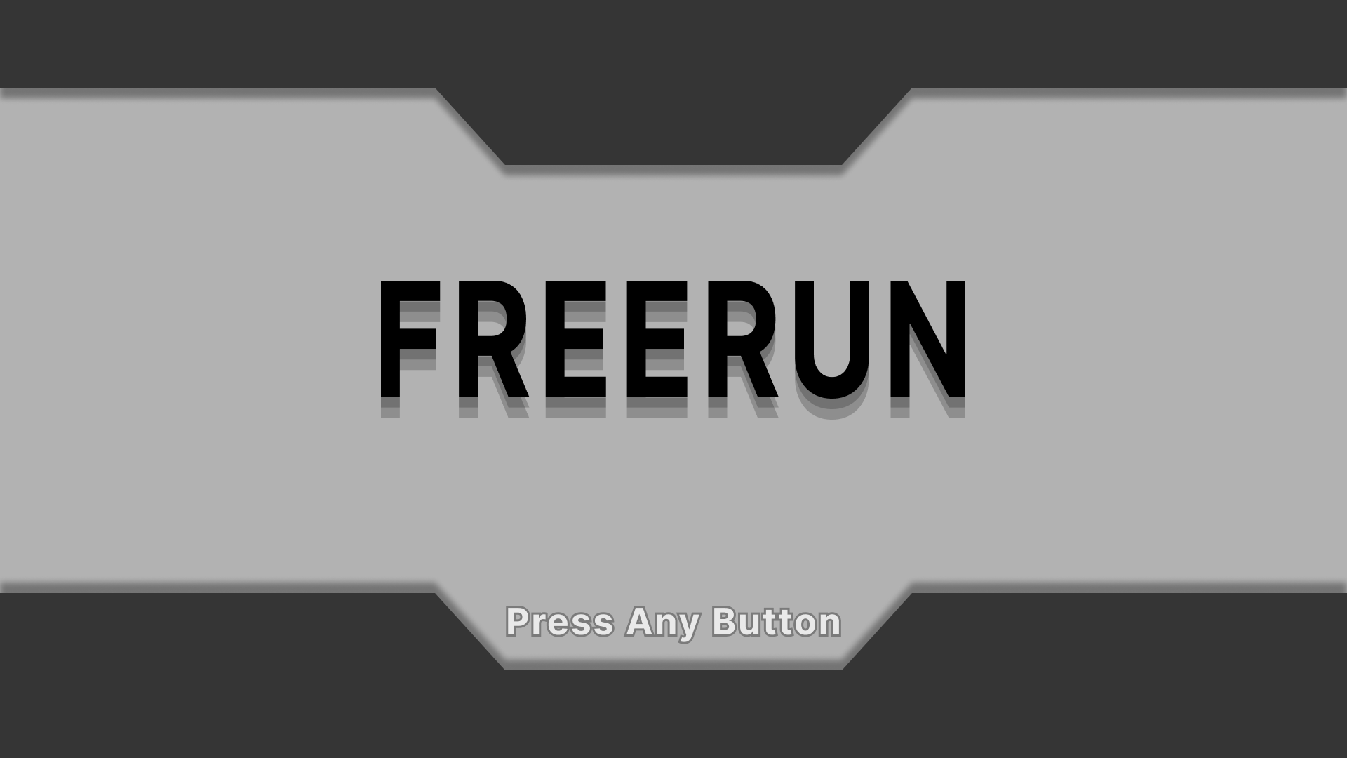
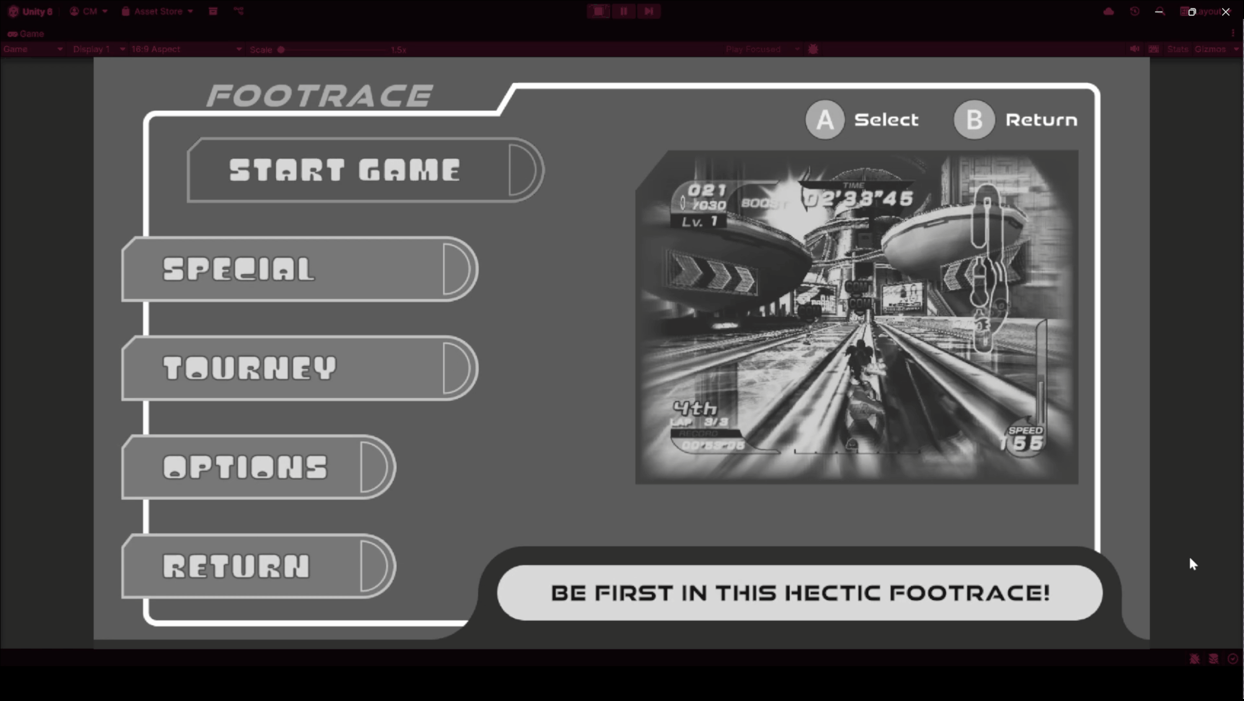
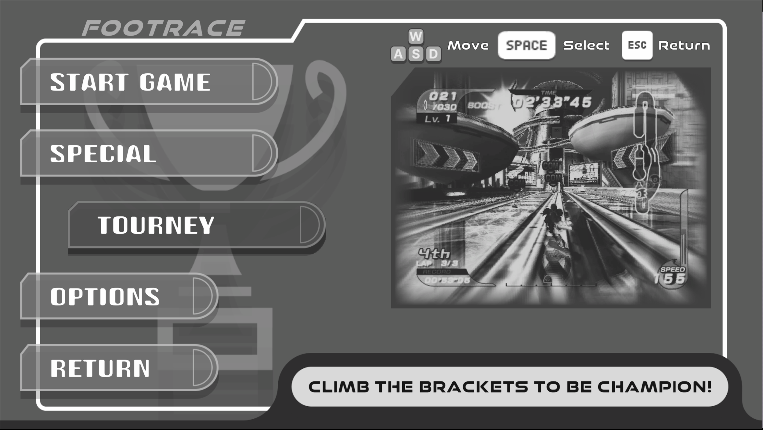
Title Screen + Sequence
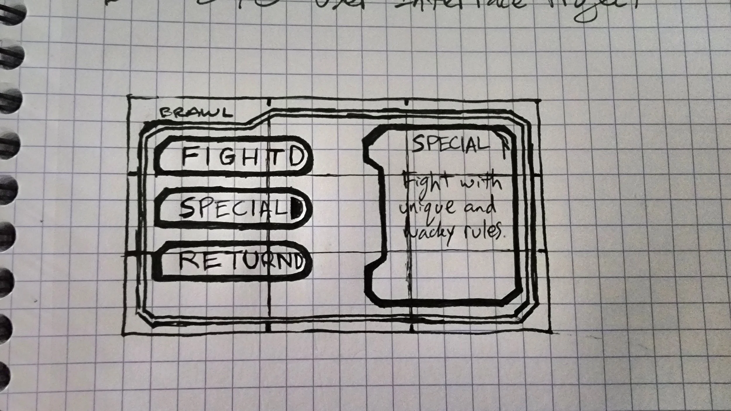
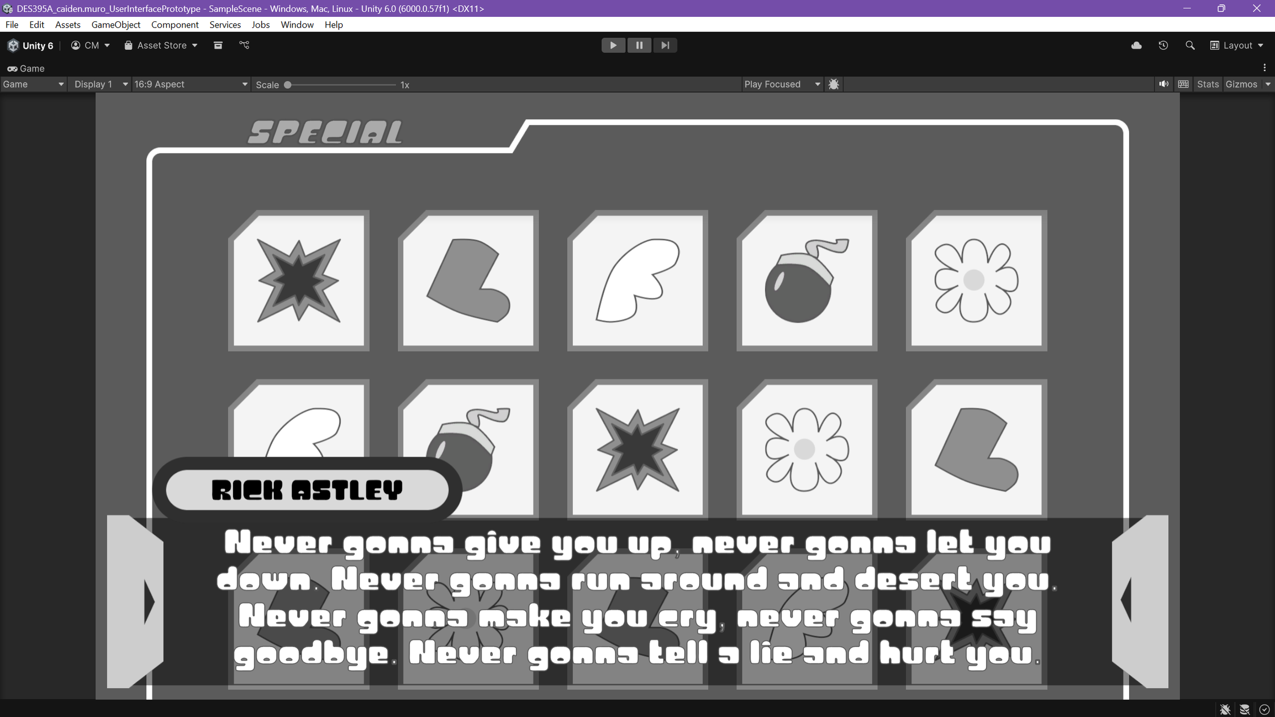
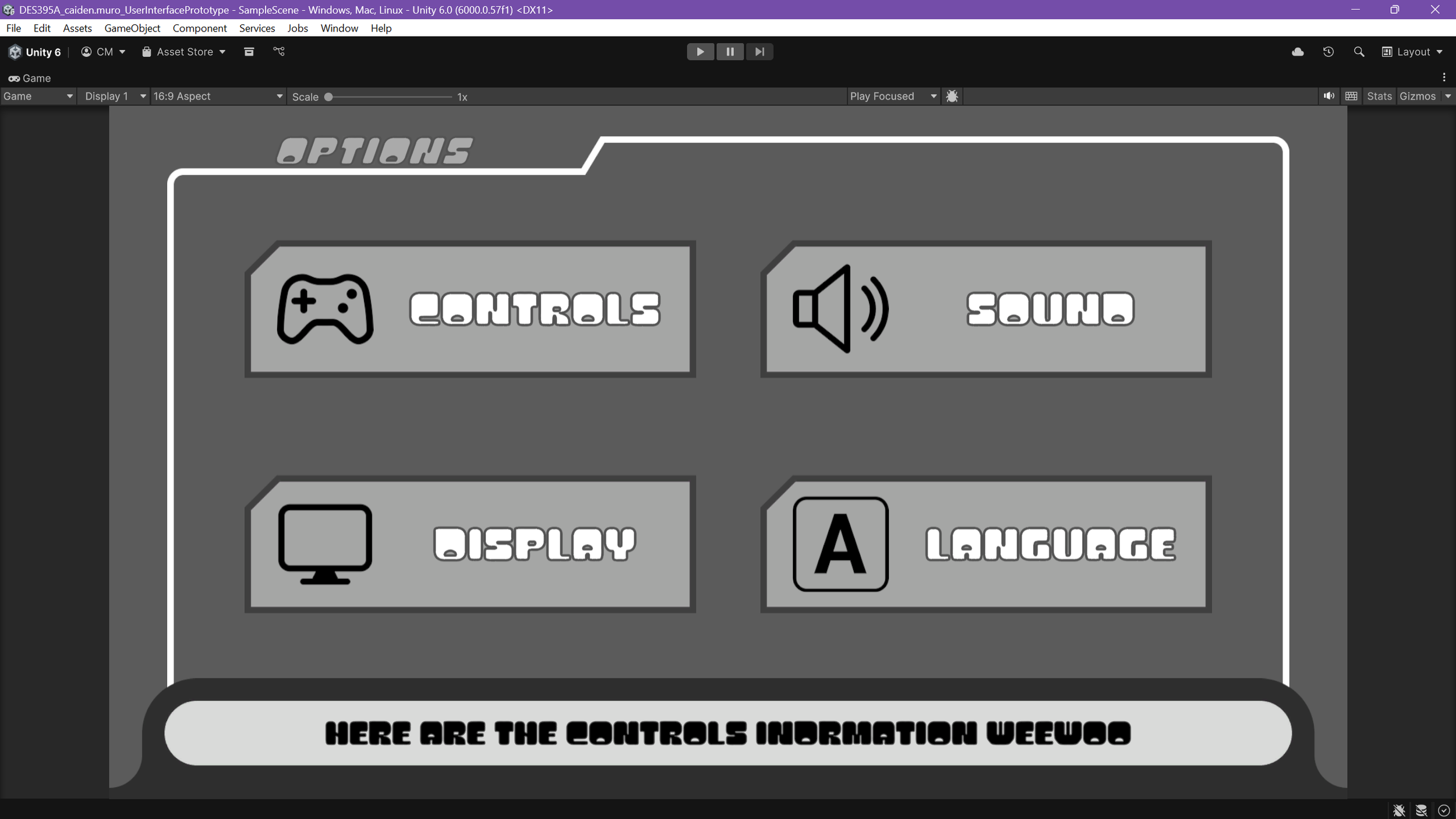
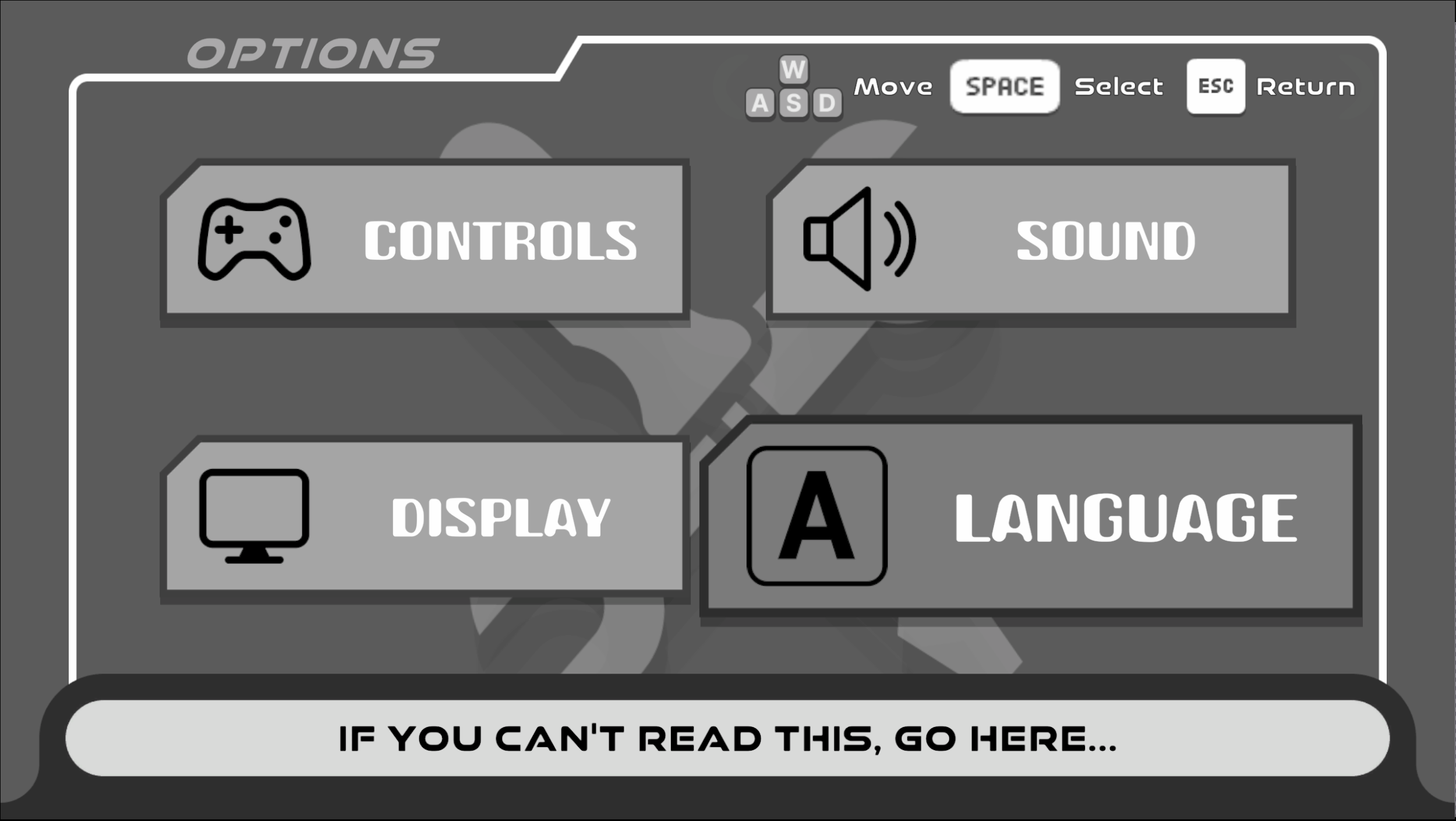
Main Menu with 3 sub-menus
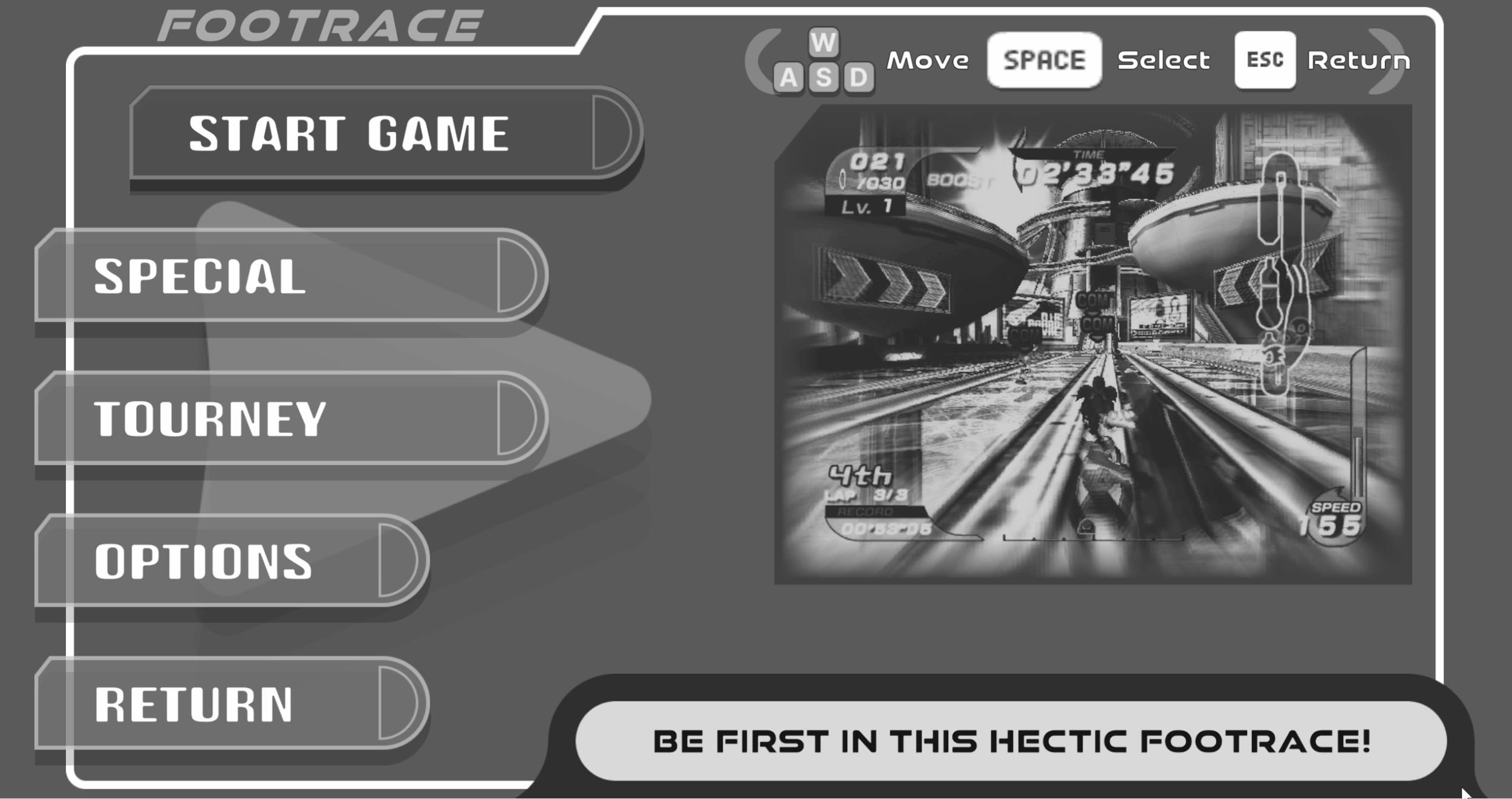
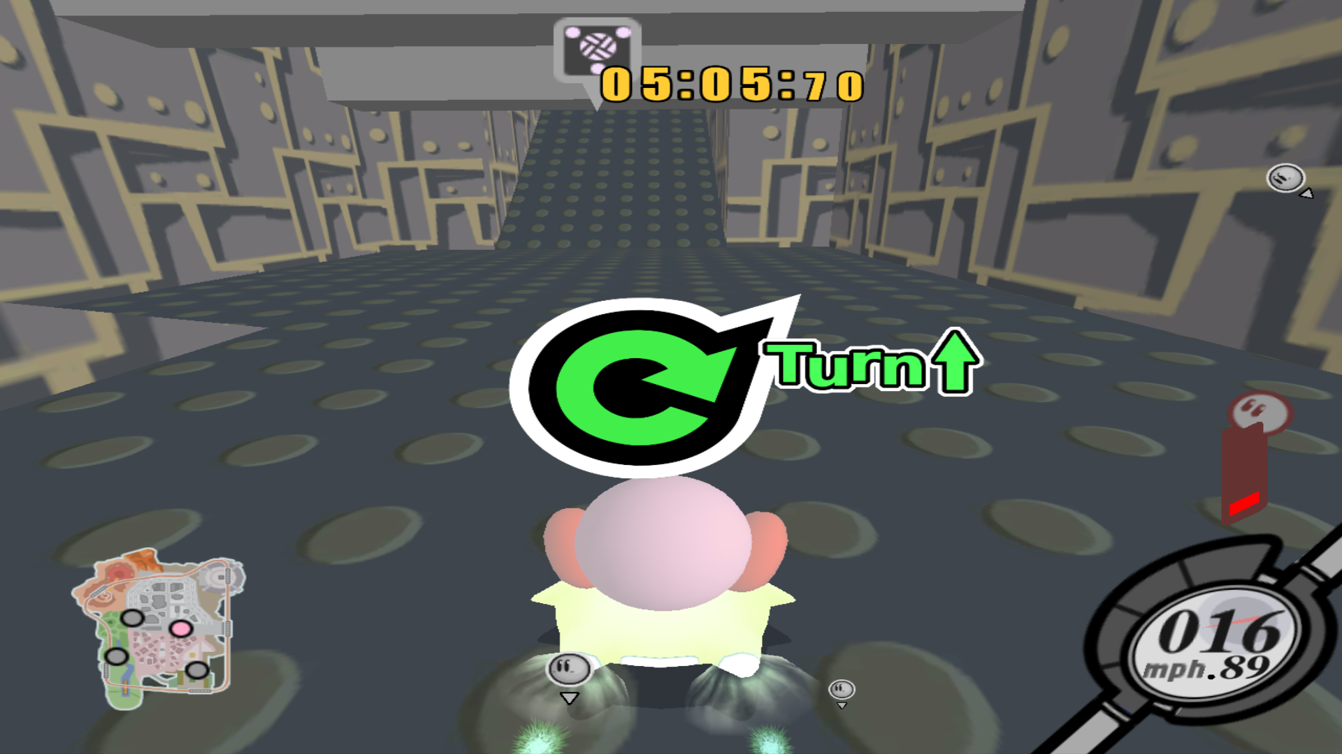
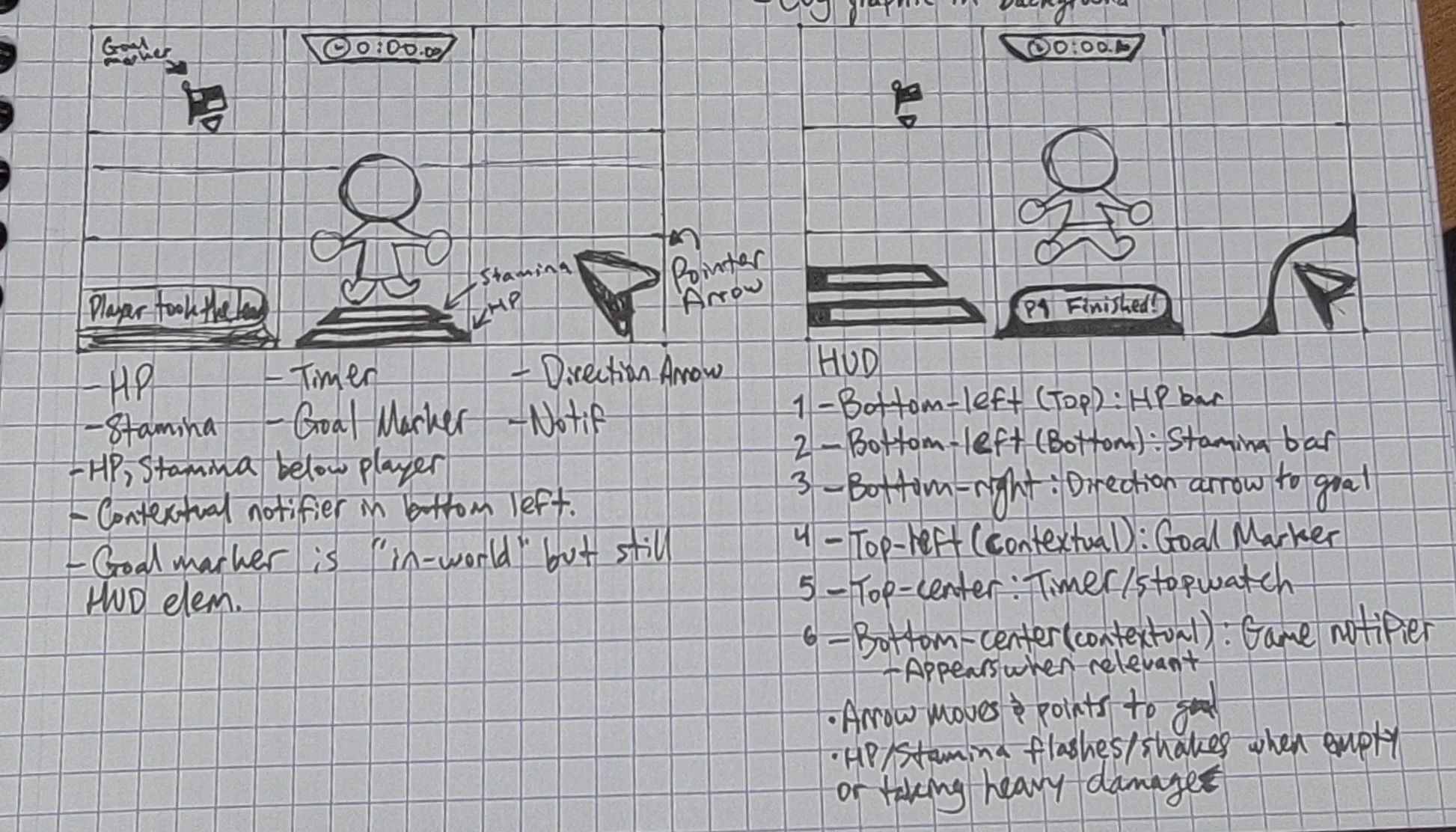
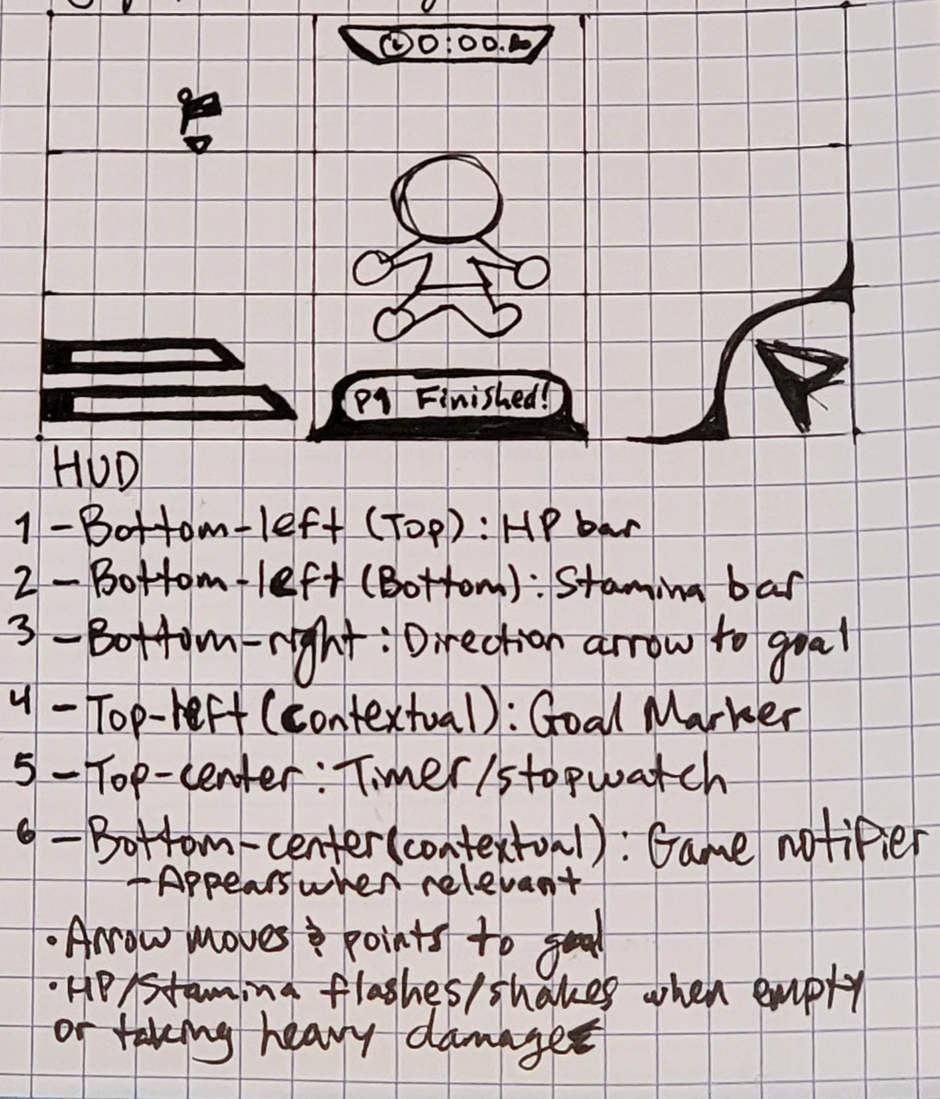
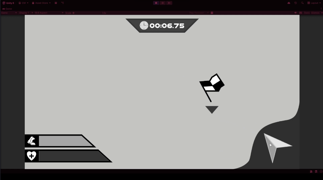
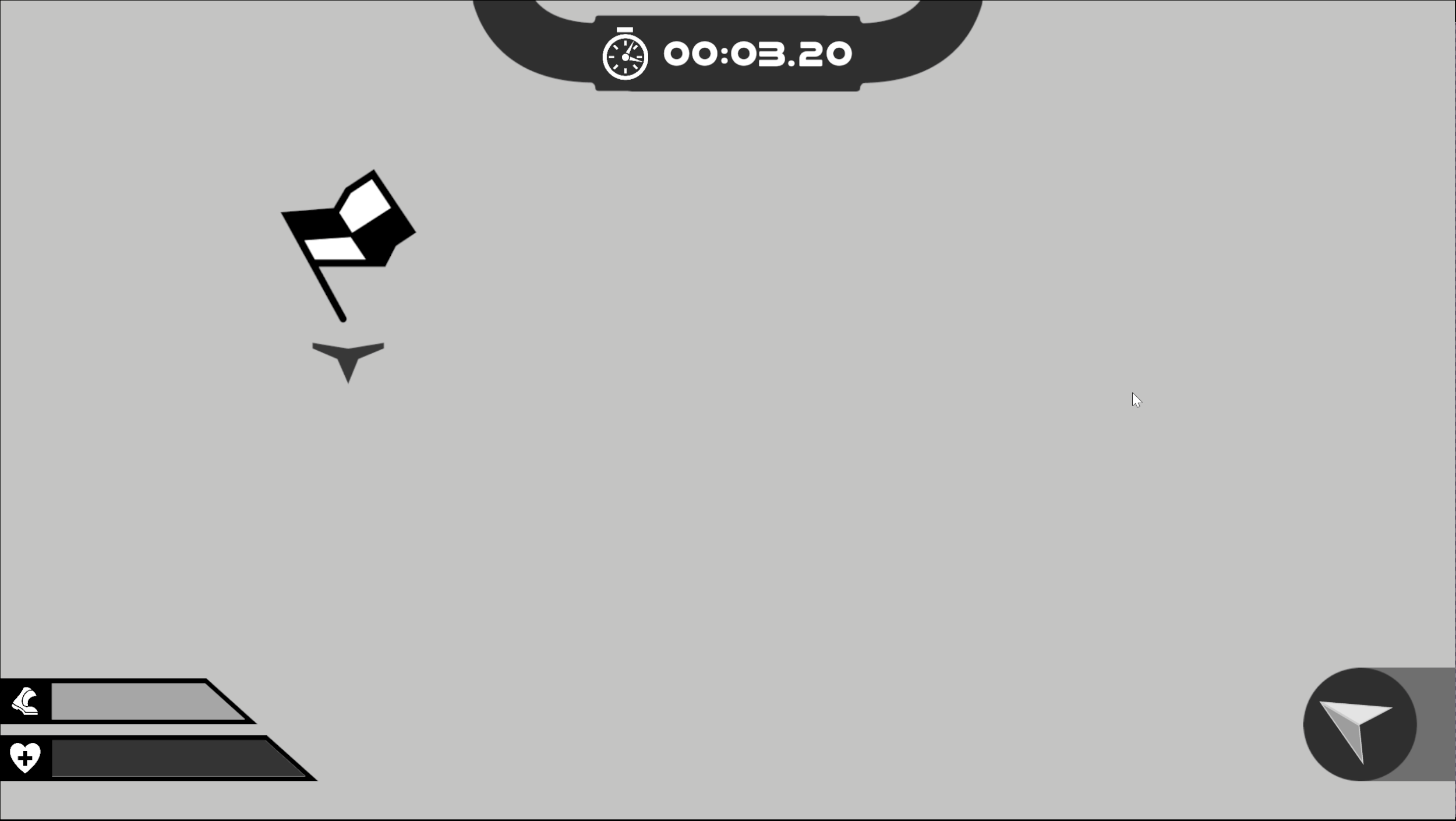
Dynamic HUD with 5+ major elements
…all the while keeping an appealing layout, movement, and feel.
Research & Direction
I went straight to work deciding where I was going to draw inspiration from that will help guide my direction throughout the project.
I decided upon a few areas to draw the motifs and style from…
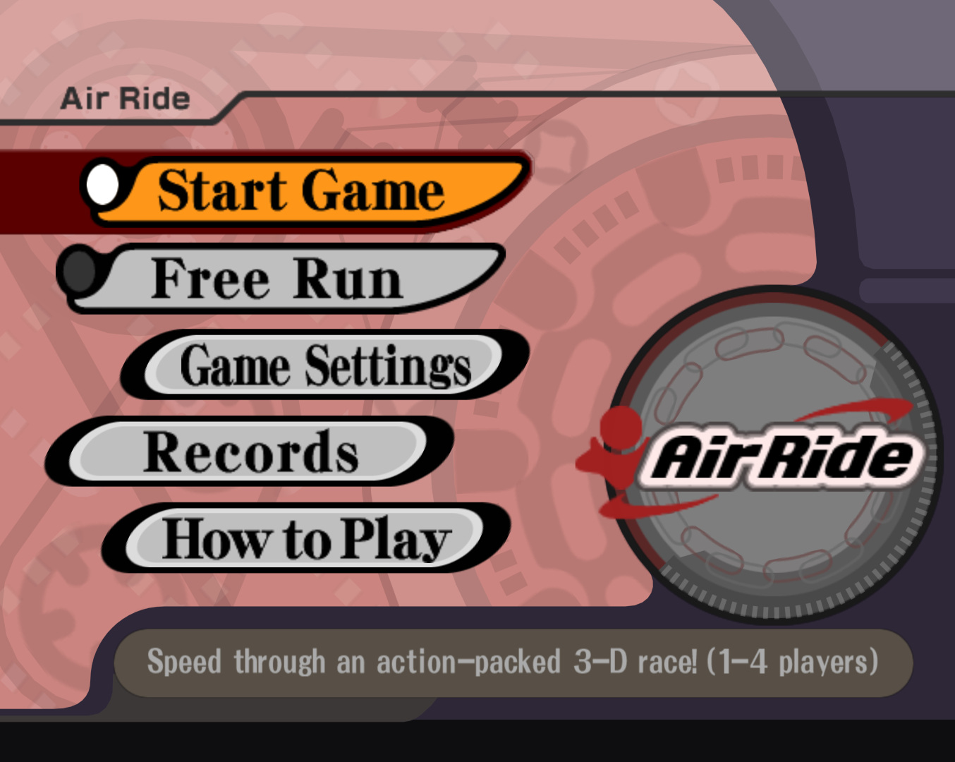
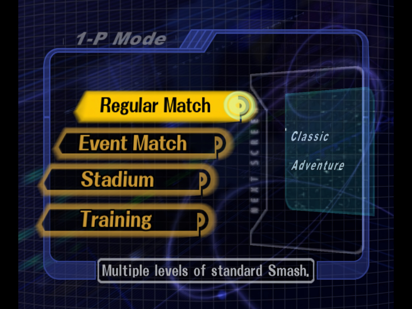
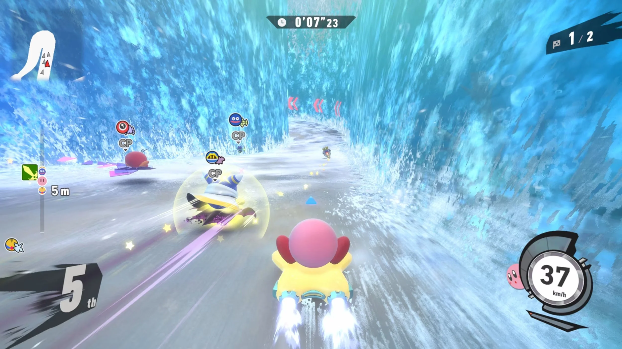
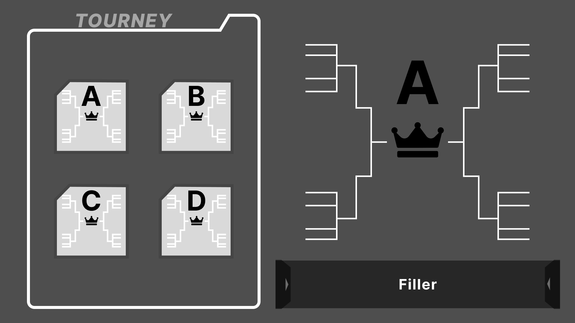
Kirby Air Ride/Riders
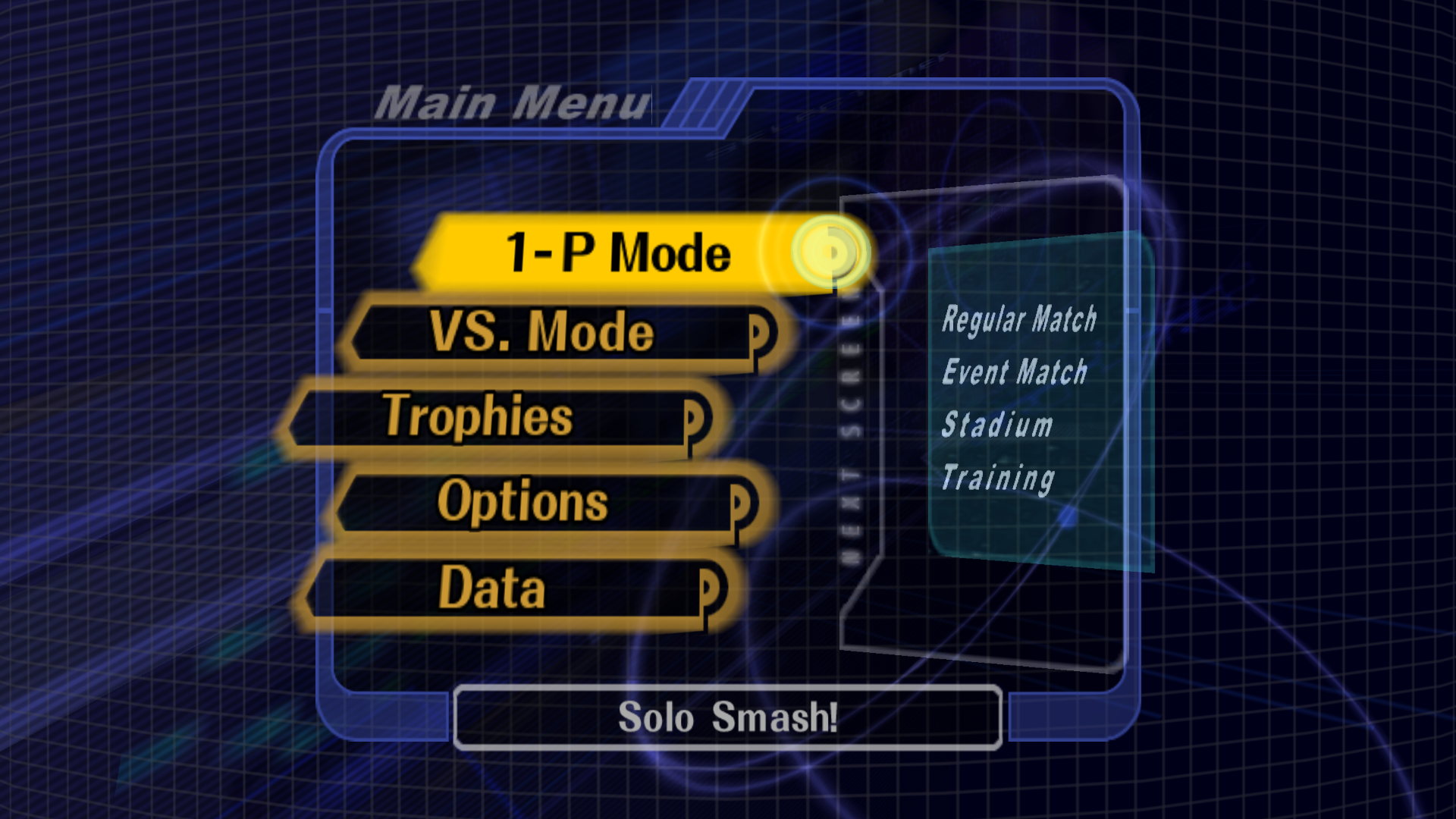
Super Smash Bros. Melee
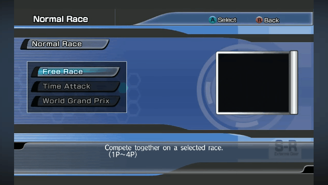
Sonic Riders
These inspirations gave me a clear idea of how the menus should feel as well!
Planning
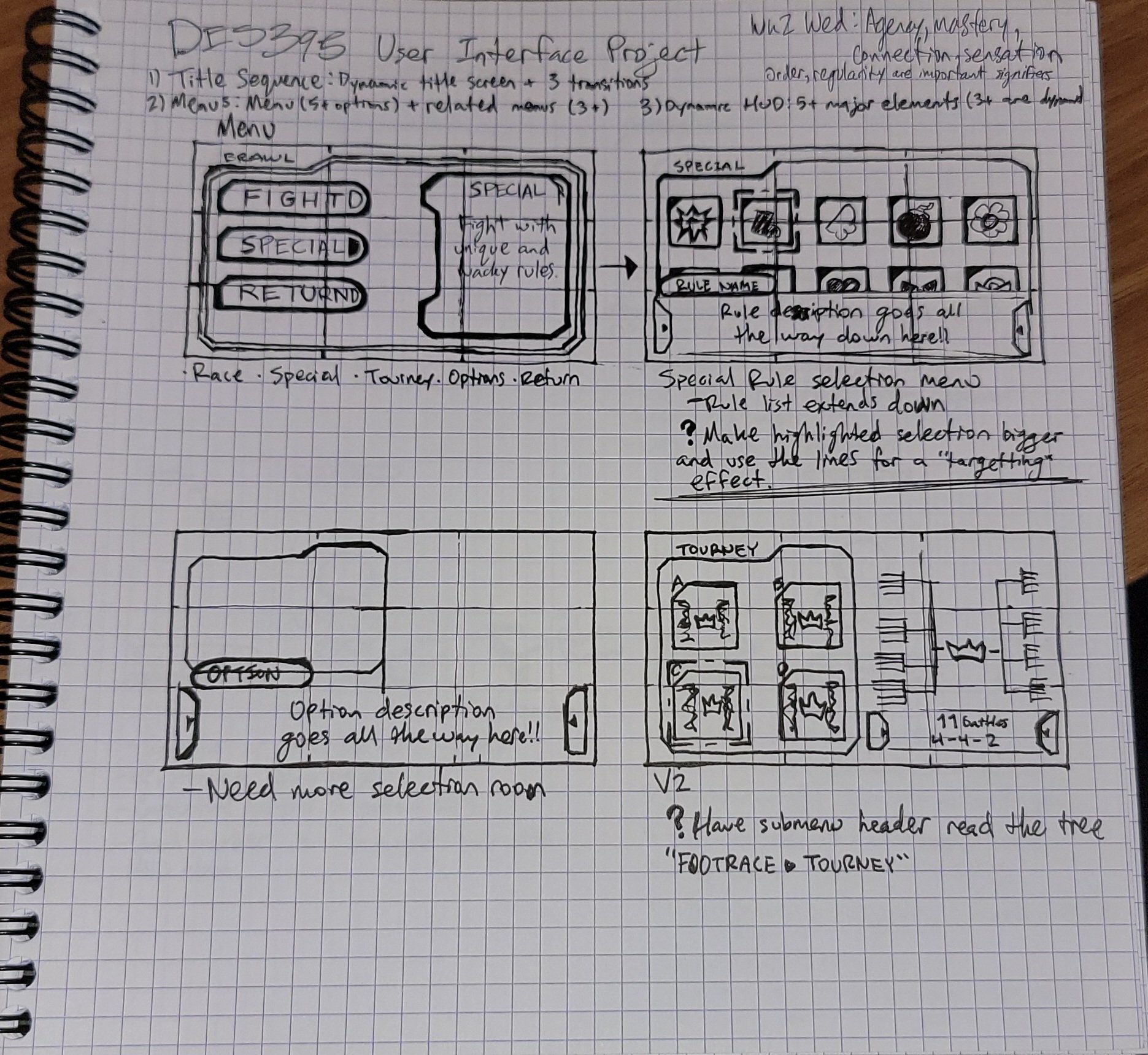
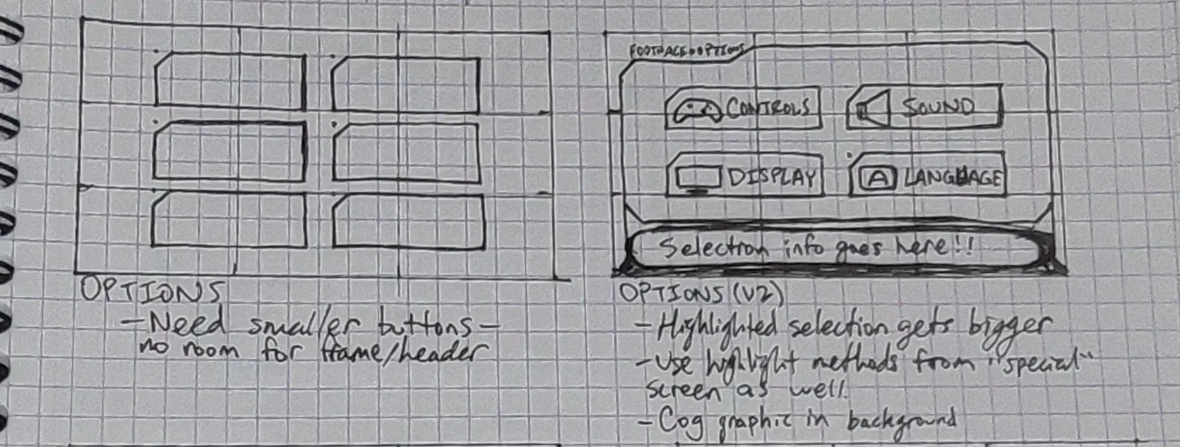
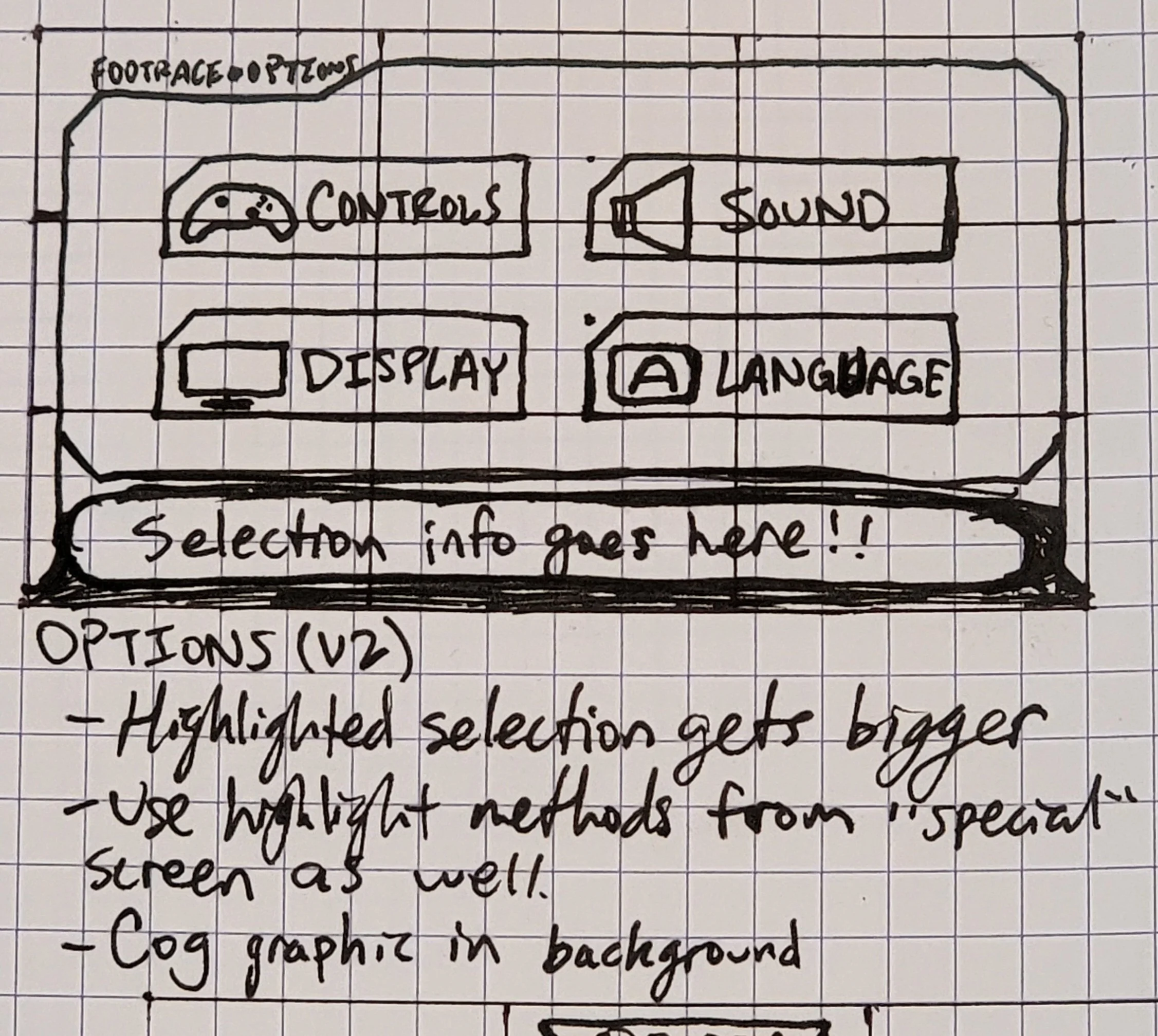
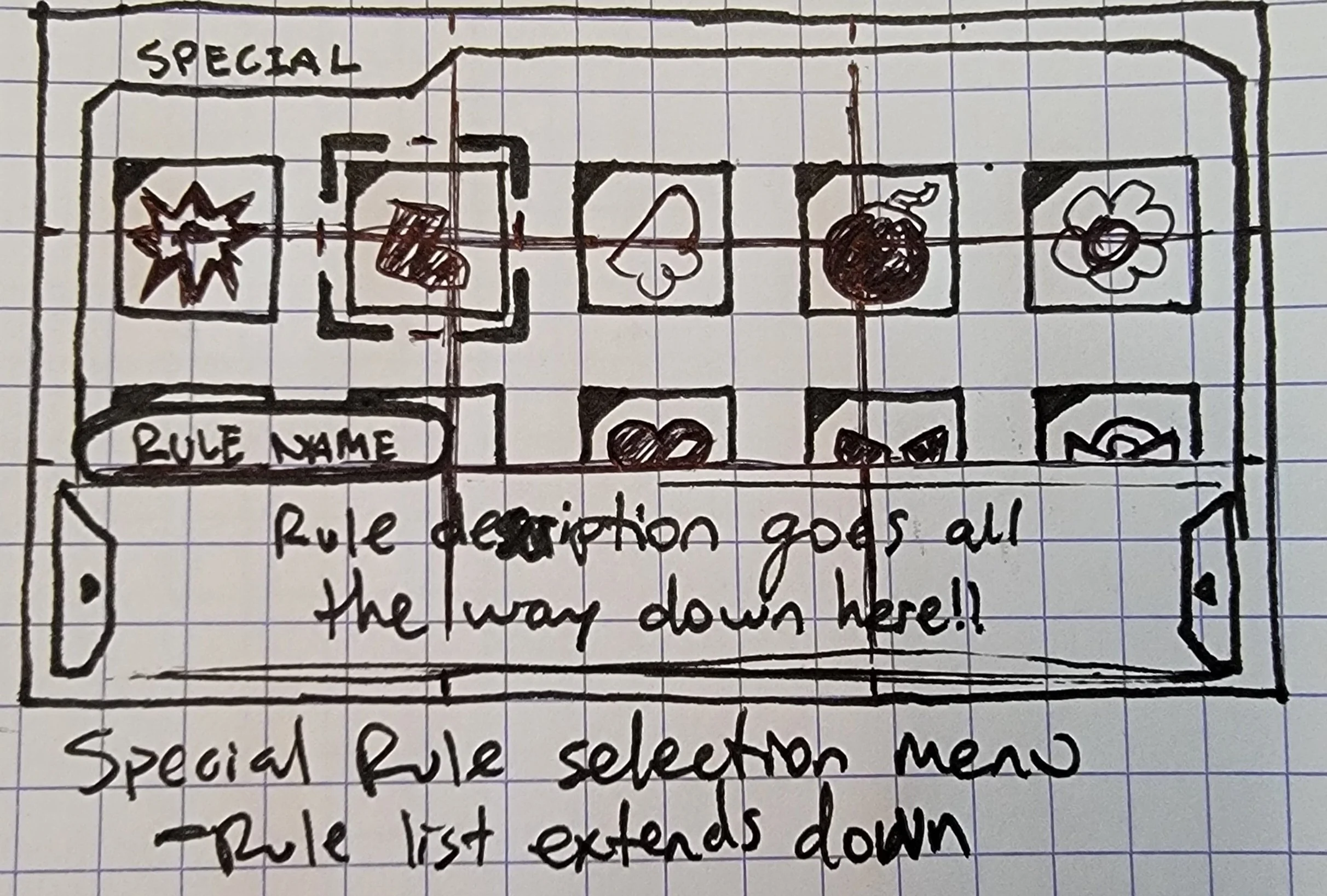
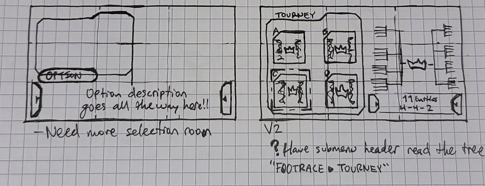
The day I was assigned this, I did my research for inspiration and went right to sketching! I like to start with the old-school pen and paper to get a quick and dirty(ish) idea of what I want to do.
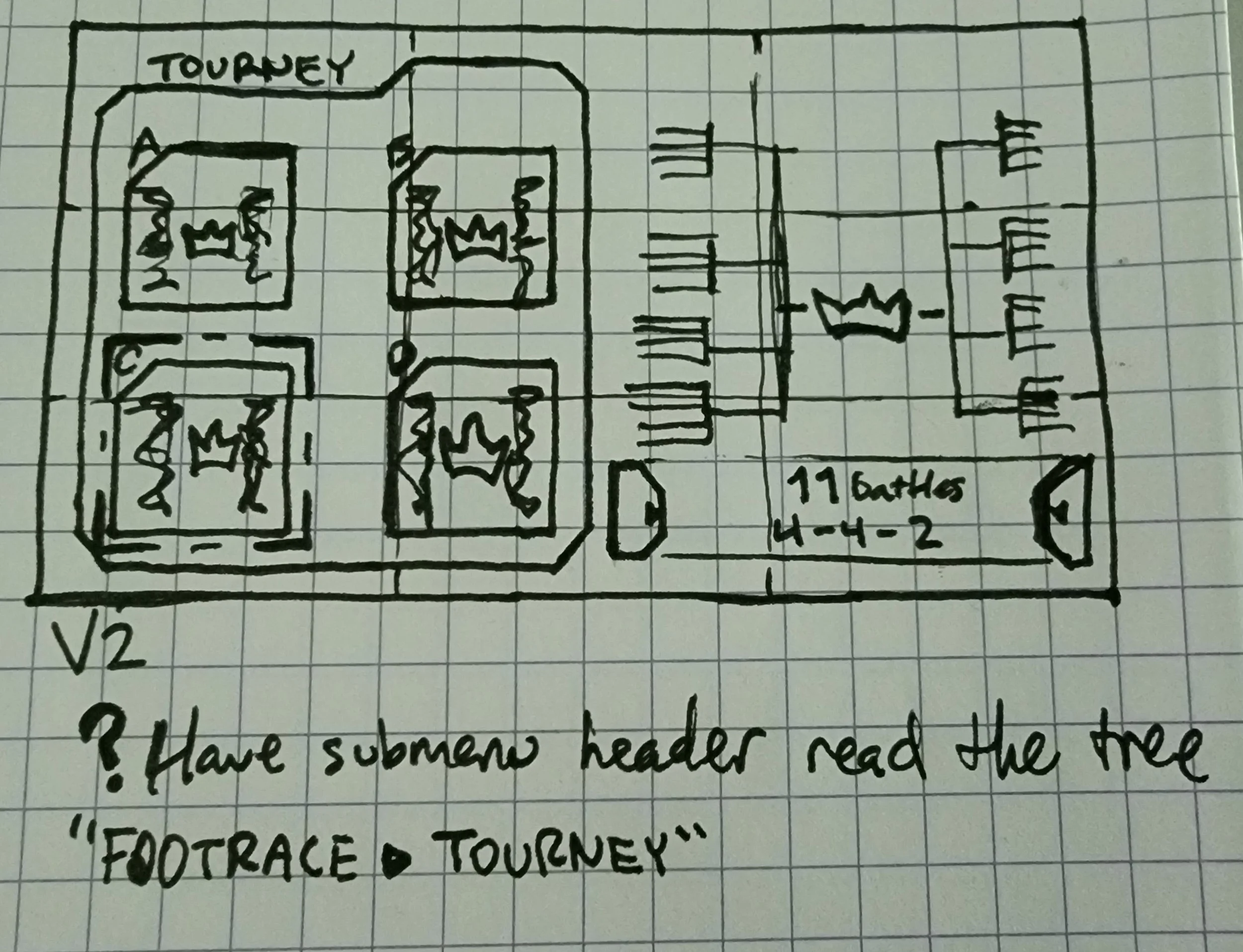
While still in the concepting stage, I made iterations based on quick notes I made. I didn’t spend more than a day getting these done so I could jump into Figma as soon as I could and get a better idea of how these plans looked on a real screen!
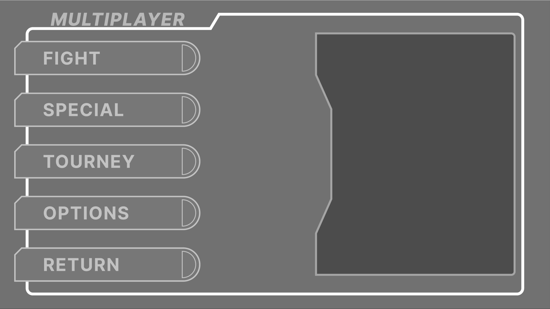
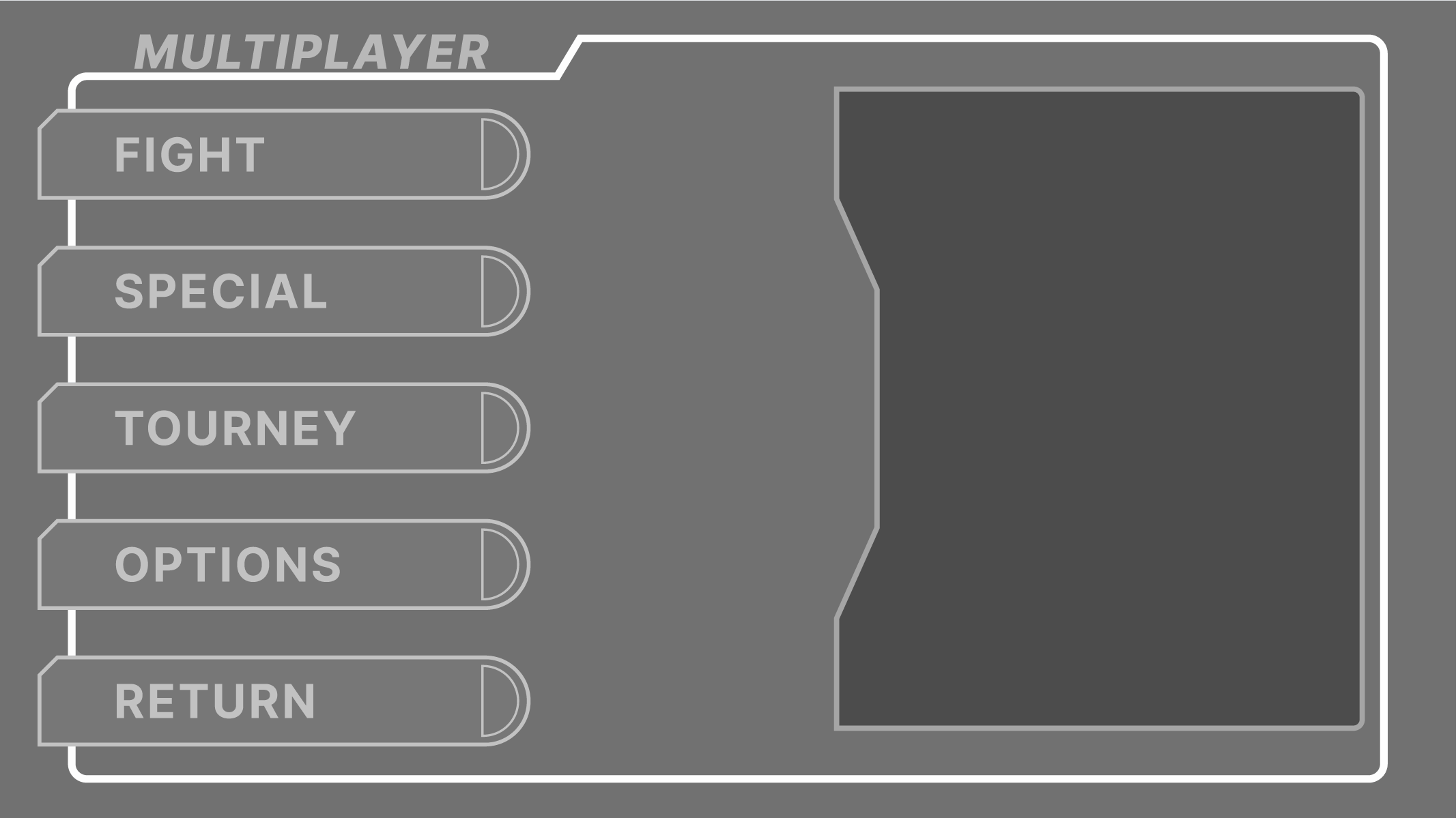
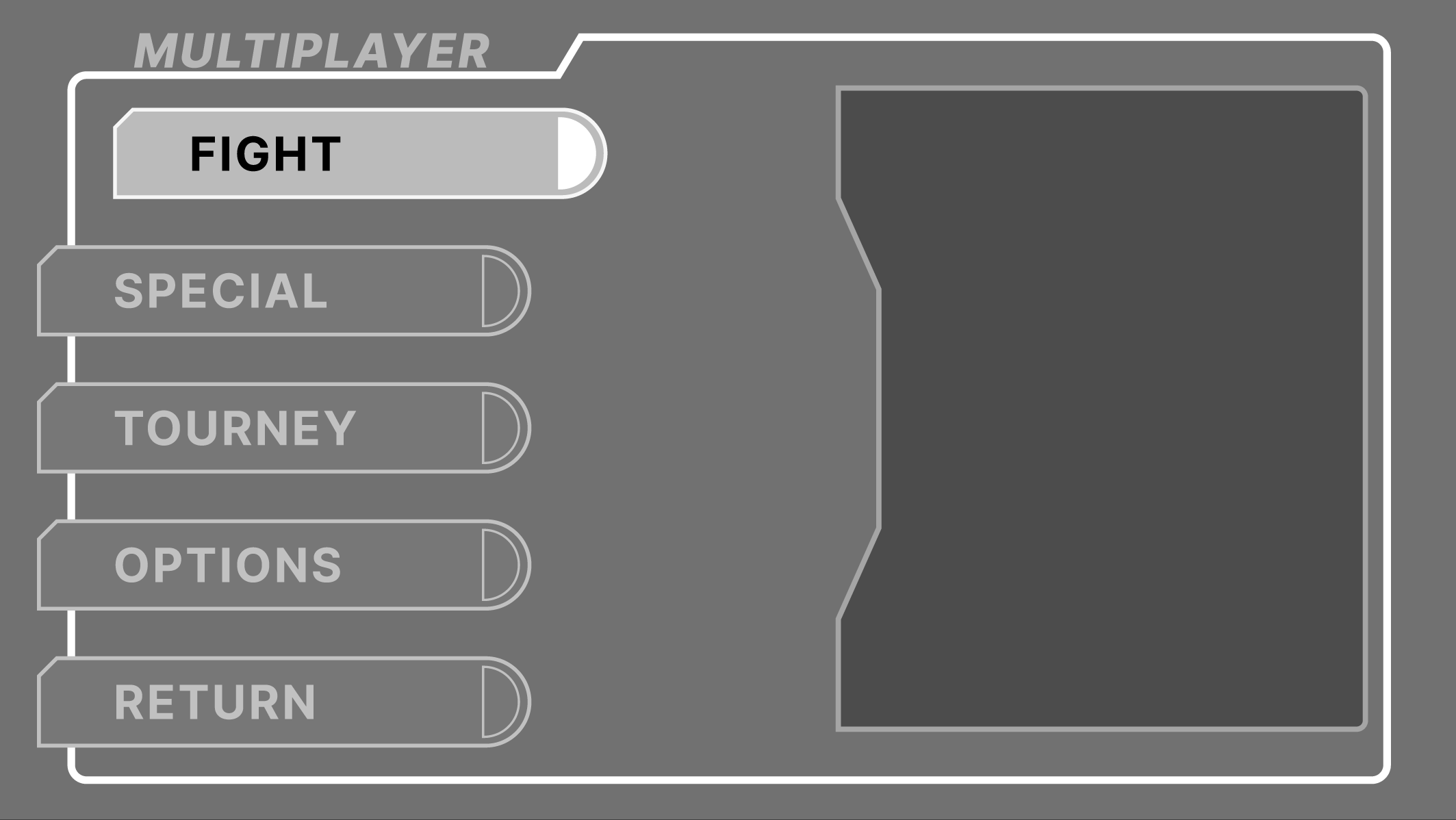
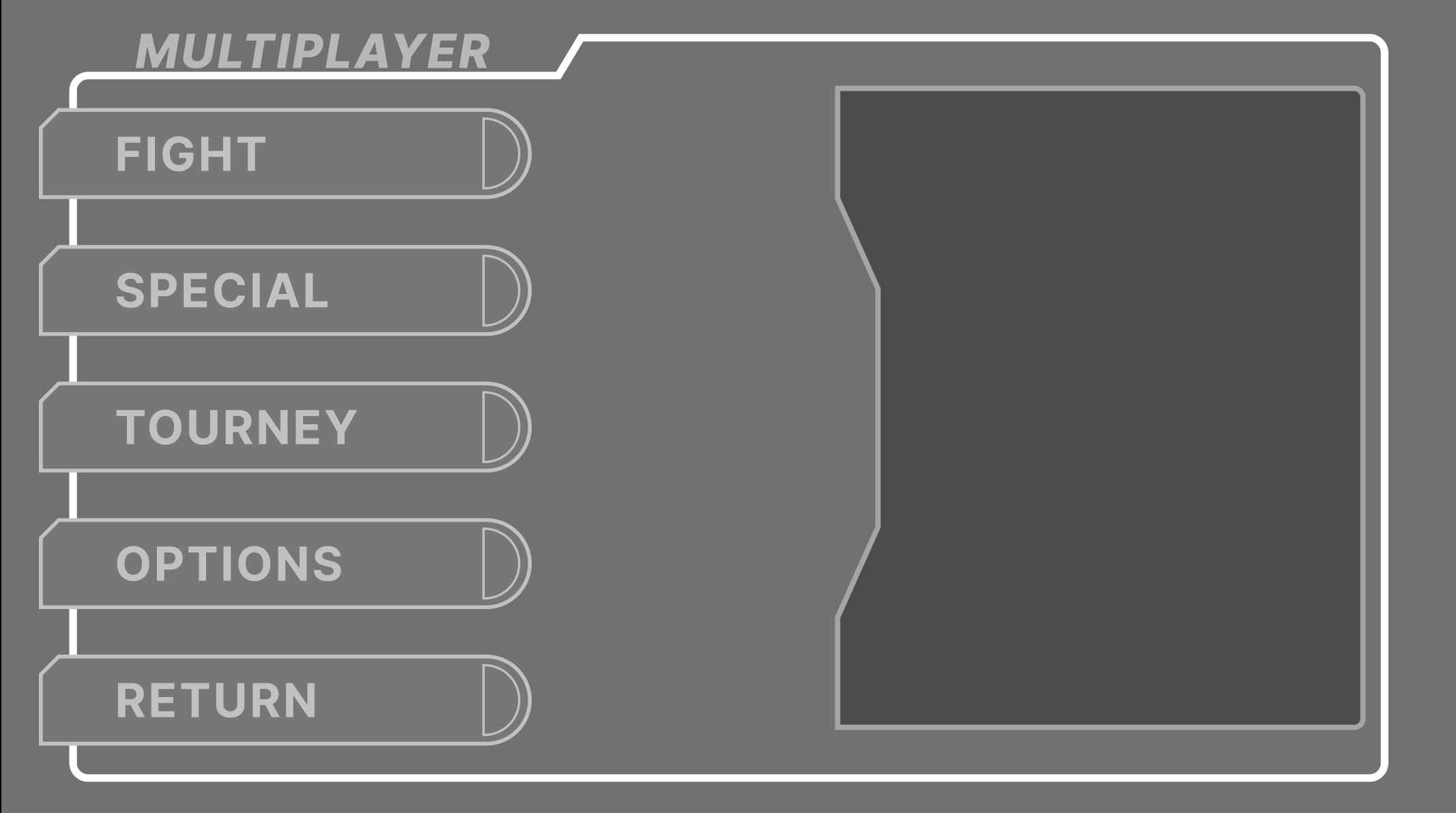
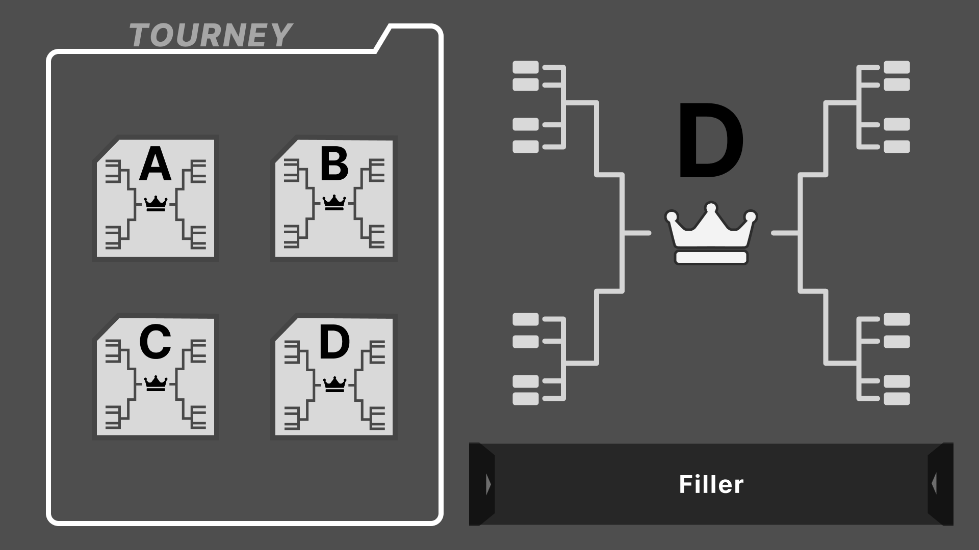

Laying Out in Figma
This is where my paper sketches make the jump to digital! And this was used as my sort of “refining” stage. While the sketches looked good to me, it could tell a different story on-screen. As well as creating an idea on how I wanted elements to move using the main menu as a sample.
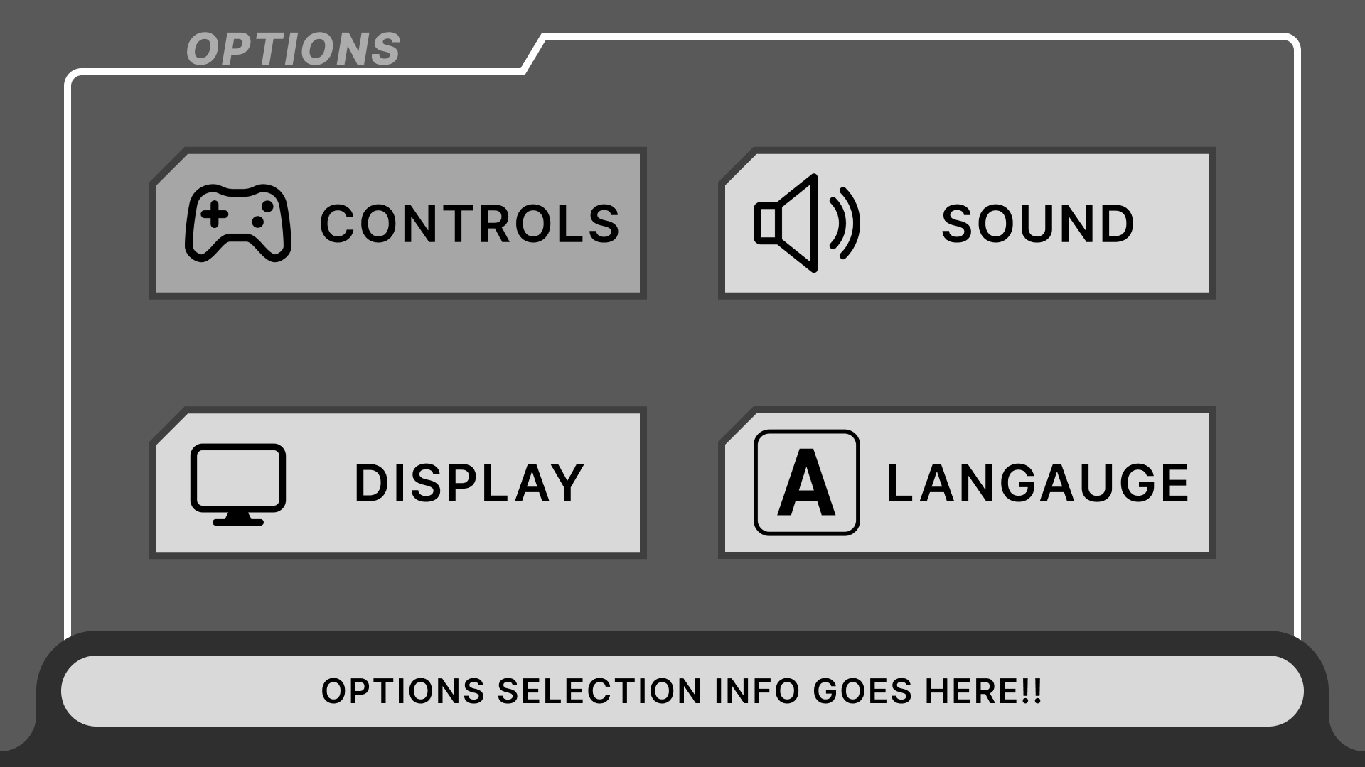
This was the case for some elements of the designs such as the Main Menu screen. It originally had a sort of tab-like shape on the side with a description of the highlighted mode. I realized after putting it on-screen, it looked rather awkward, especially considering its shape.
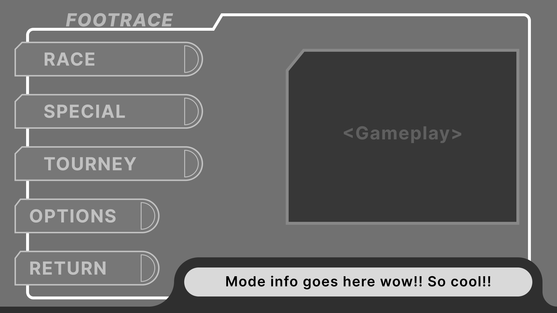

Iterating on the Main Menu
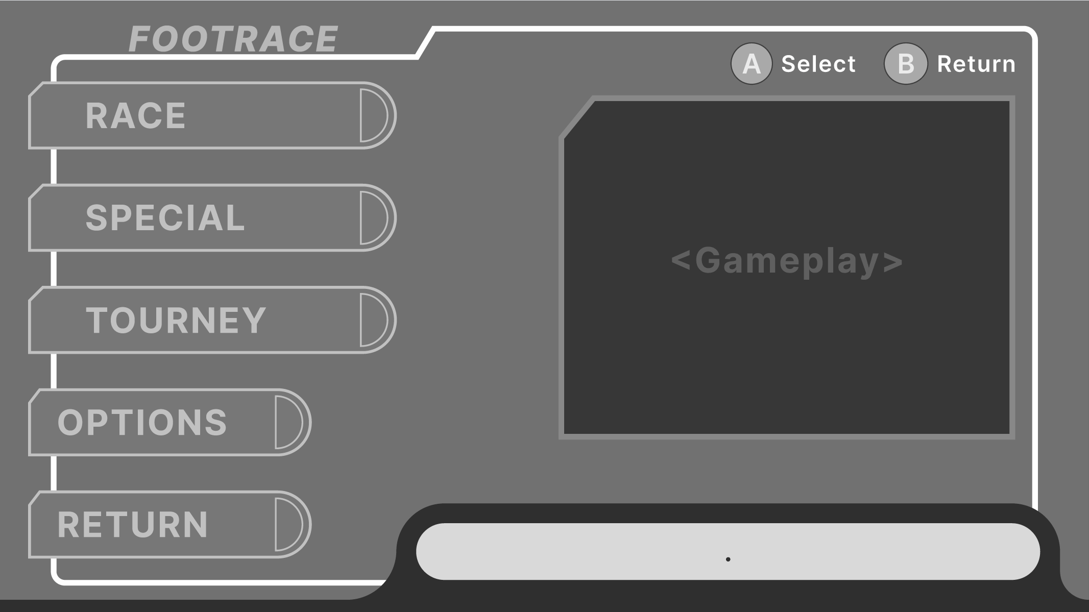
It was at this point I thought to rather include the concept of a “preview video” showing gameplay of the highlighted selection. I found this solution better because it would visually show the player what they are getting into rather than describing it.
But the functionality of describing the selection is not lost! Dipping into my Kirby Air Riders inspiration, I added a similar description box along the bottom right. This not only keeps the description, but also fills in otherwise dead space while reinforcing the information that is trying to be delivered through the preview video/image!
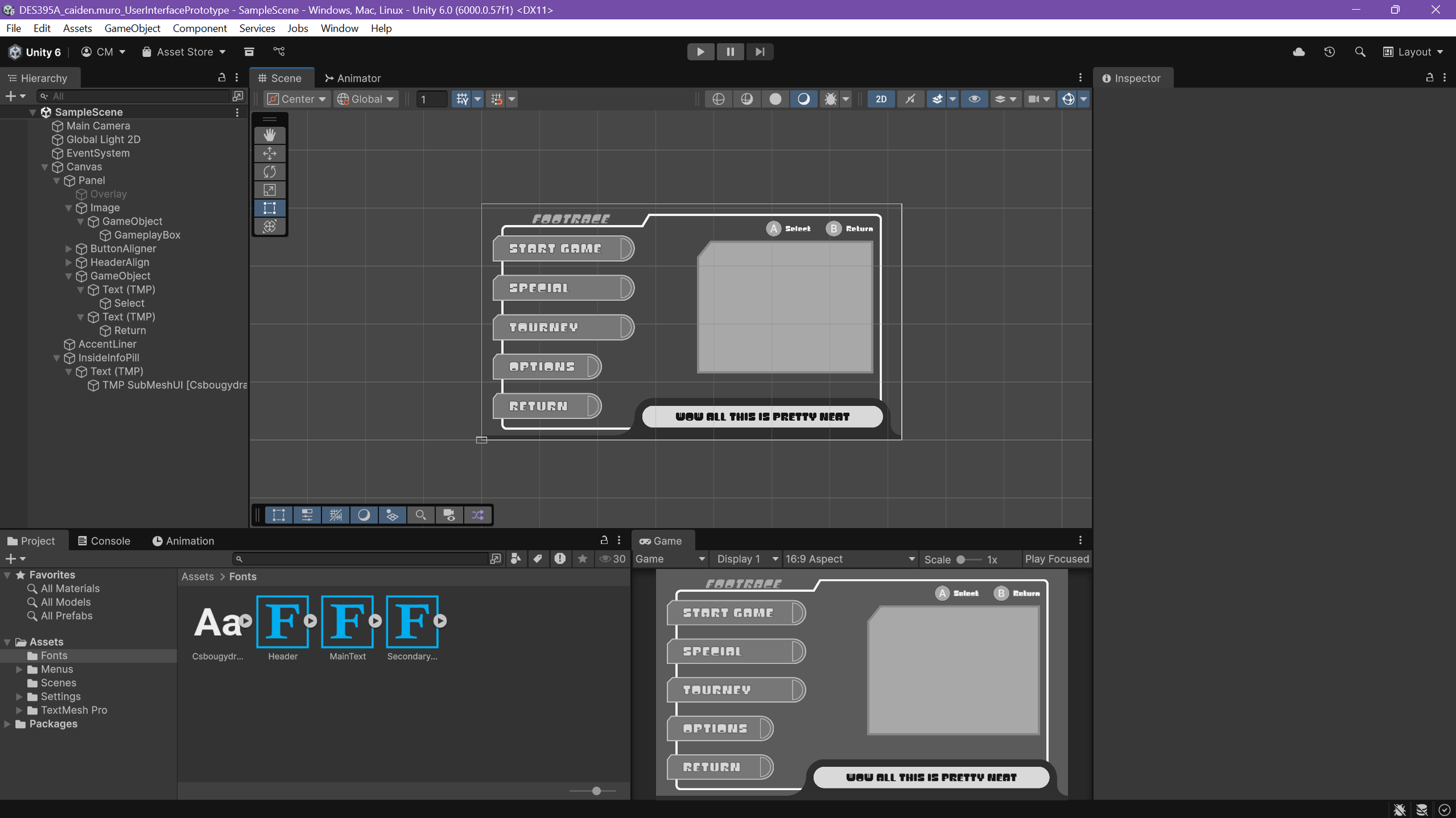
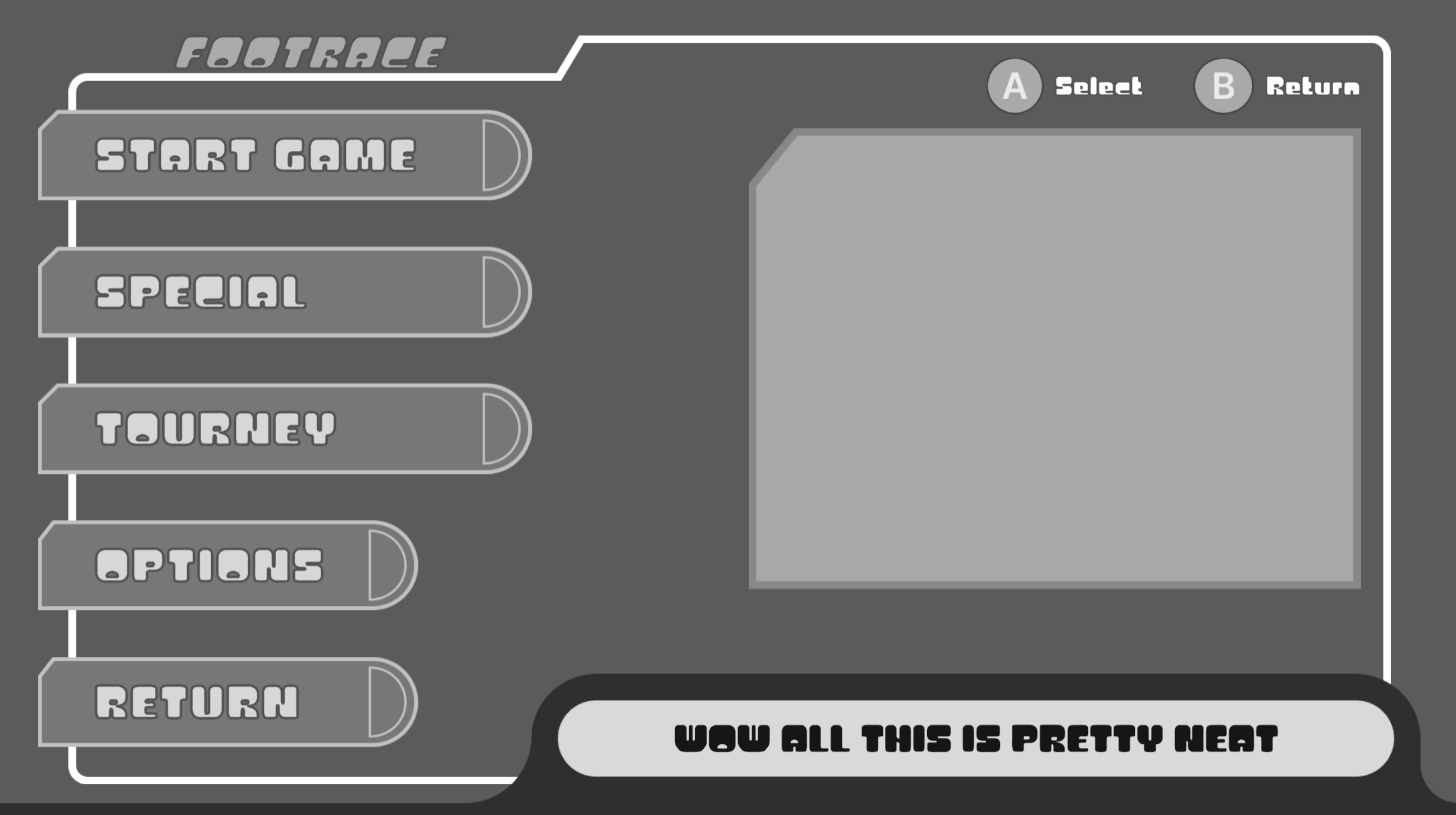
Jumping to Unity
With the layout decided on and the “style” set (as well as how I wanted it to move), I started up a new project in Unity and began exporting the assets I quickly made in Figma to Unity. This let me speed up the time it took to create a good-looking prototype in-engine.
Once all the assets were in, it was a matter of layout groups, hooking up script managers to the menu, and adding animations to the actions.
Adding Motion
With Unity, I was able to take full control on the way everything moved! Taking advantage of my experience using Unity’s animation system, I made snappy and stylish animations for navigating the menus and especially for transitions.
This elevated the prototype from being a little blockout to a showcase of what the UI was going for.
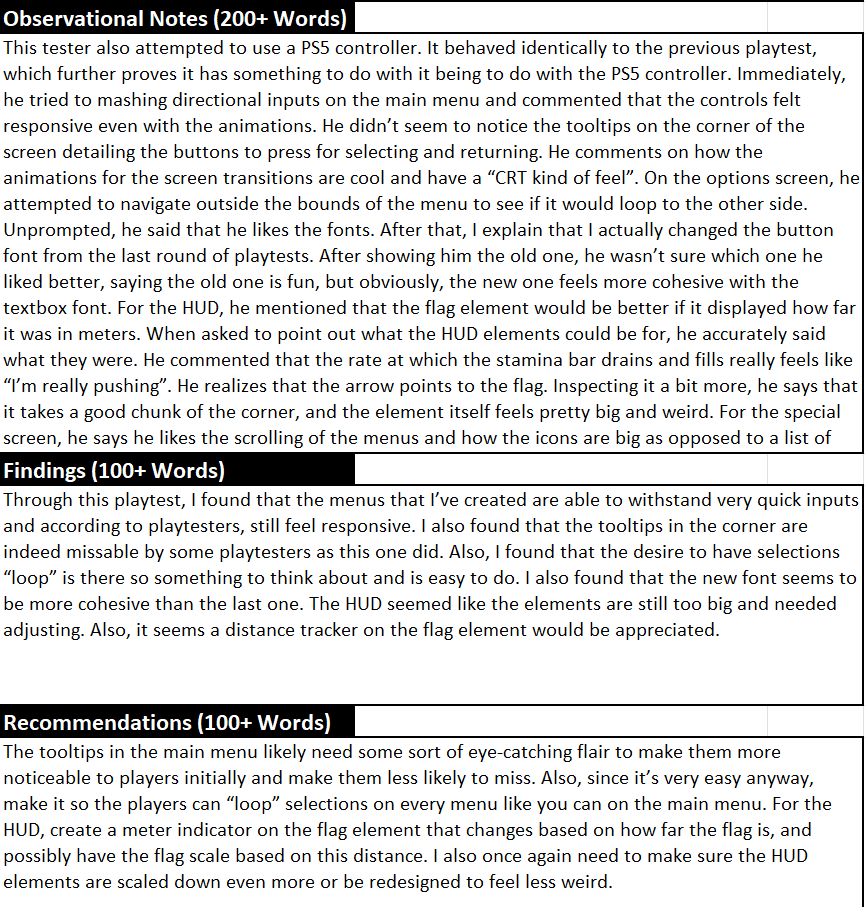
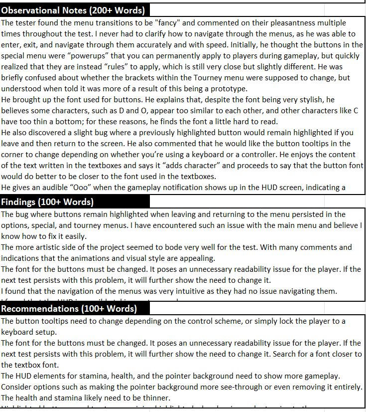
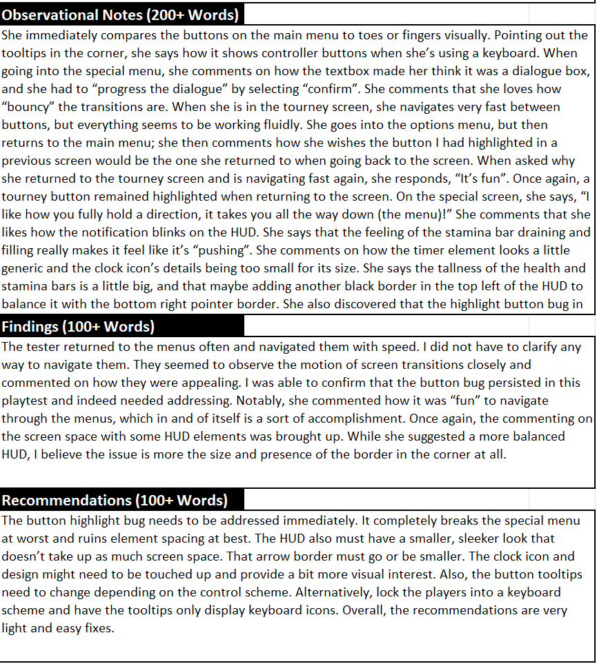
User Testing
After getting the menus in-engine with motion, I went and grabbed some fresh playtesters and observed their experience. As well as ask them some questions.
I found a few issues from these playtests…
The font I was using was, while stylish, a bit hard to read with its unbalanced look.
The HUD was taking too much screen space.
The timer element on the HUD seemed to look “boring”.
Bugs with buttons staying highlighted when returning to a menu.
The “Controls” element in the corner needs an element for navigating.
“Looping” selections for all menus like the main menu (pressing right when highlighting the rightmost element will take you to the leftmost etc.)
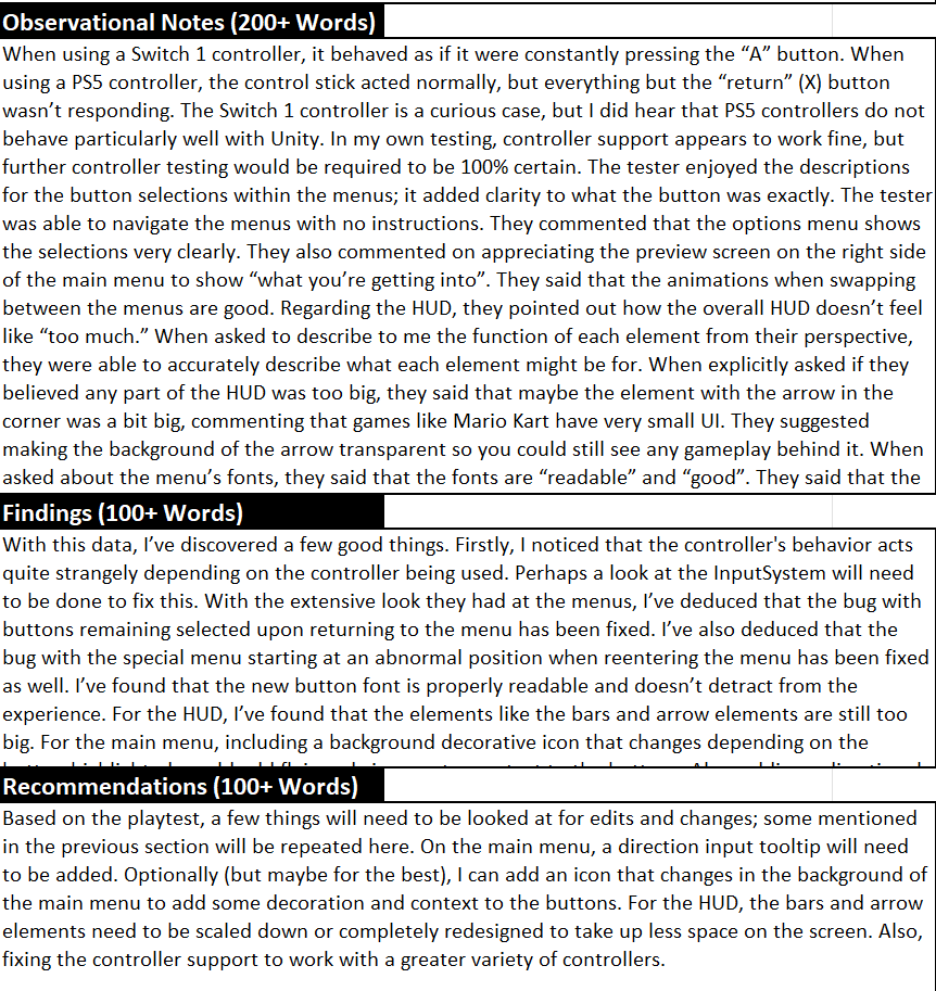
And some good aspects from the playtests…
Navigating through the menus was “fun”.
The transition animations “felt good”.
Navigating within and between menus was intuitive.
The visual style was “very appealing”.
The prototype was able to withstand very quick inputs even with the animations
The stamina bar decreasing on the HUD felt like you were exerting energy despite no gameplay.
So it seemed the visual appeal of the prototype was shining through but there were more practical, technical details that needed ironing out.
Changes
This gave a very clear checklist on what needed some TLC. Some issues were straightforward to fix (decreasing HUD size, addressing bugs) but here is what I did to fix some of the others…
I scoured for a font that had a similar “vibe” I was looking for but offered much more readability paying attention to letter spacing and width.
Redesigned the timer element to have more of a thematic look to it.
Added a navigation element to the controls in the corner of the menus that also change depending on input type (“WASD” for keyboard and “L stick” for controller).
Edited the control input to allow for looping selections for all the menus.
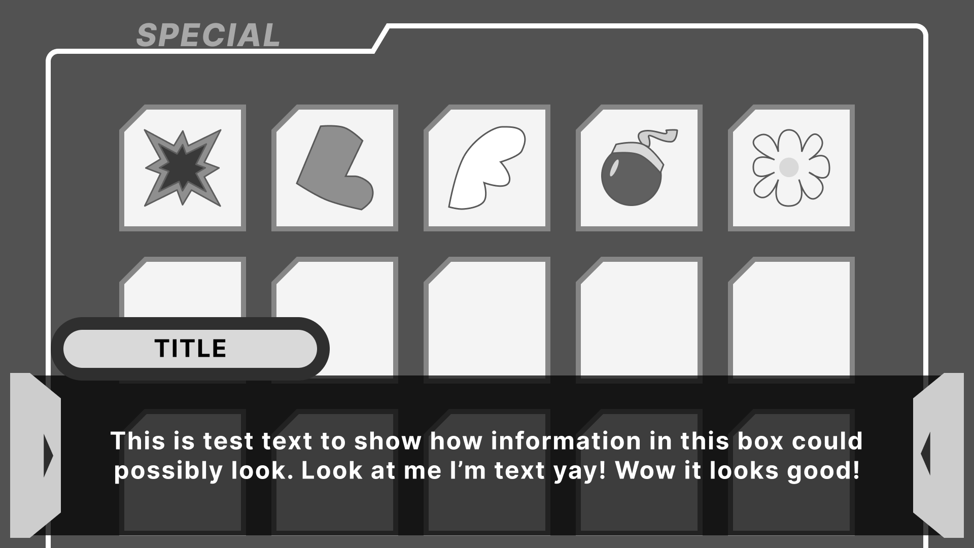
In addition to this, through my repeated playtests, I noticed the backgrounds of these menus appeared to feel sparse. So I had the thought that perhaps I could incorporate a sort of dynamic element that could apply across screens. Through this thinking, I decided that I can associate icons for every selection on the main menu that could also fill space within those sub menus.
Results
After making those edits, I put them in front of the instructor and a couple more playtesters. The prototype was received with overwhelming praise. “Could stand in the industry” is a quote from my instructor. While I can’t validate how true that is–it was quite a comment to receive. This project was done about 3 weeks ahead of schedule.
Post-Mortem
Despite the success the prototype seemed to have, I believe that I’m still not quite totally satisfied with my HUDs in the project. I think my menu-making sensibilities are sufficient, my HUD abilities are more lacking.
I also believe that my implementation could have been lower-impact performance-wise. Not that the prototype had performance issues but I believe with more technical know-how, I could make it even more optimized.