
Accessibility UX Project
Results
Identified an accessibility issue, researched, designed, and presented my findings and proposal to make a game more accessible.
Team Size
Solo
Tools
Paper, Figma
Development Period
Begin: February 2025
End: March 2025
Overview
This project was a fun one–I identified an accessibility problem in a game, and researched how I could make it more accessible through a proposal.
Project Goals
My task had clear goals:
1. Identify an accessibility issue in a game
2. Identify the population who is excluded from participating due to that issue
3. Design a solution to that accessibility issue
4. Reflect on the process of completing this assignment


The Issue
So what did I look into? I chose Pokemon. This might seem like a weird decision considering it’s a game mainly for children. But I argue that’s exactly the reason it should be taken into consideration.
A game like this is usually someone’s first time trying a turn-based RPG. For a child, this could be one of their first games as well. Games like this require the ability to perform projections ahead of time to determine how much damage an attack may do. While this might be no issue for many people, what about children learning math? Or what about people who can’t perform or conceptualize math?
Are they unable to enjoy this game especially when a big focus of the series is battling other players?
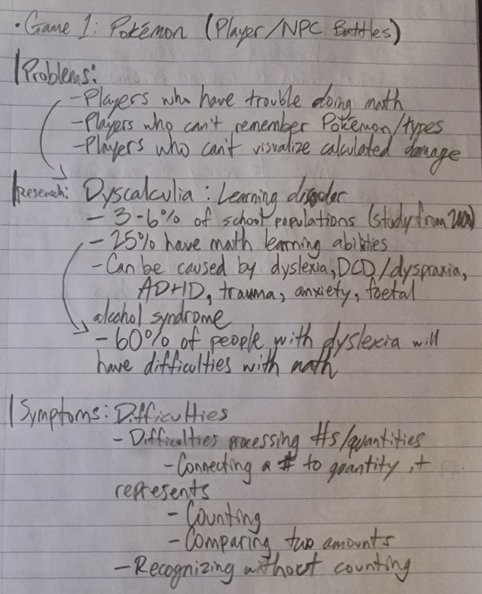
The Research: Who’s Affected?
While children are definitely a big part of this, I believe people with dyscalculia and other math-related difficulties are also the biggest ones affected by this design/game.
Dyscalculia, as I’ve found in my research, is not an insignificant part of the population. In fact, I believe dyscalculia is under-reported in many cases (see image on the side)! With a game as deceptively number heavy as Pokemon, this can severely limit a person’s enjoyment of the game if they cannot make number projections for their turn.
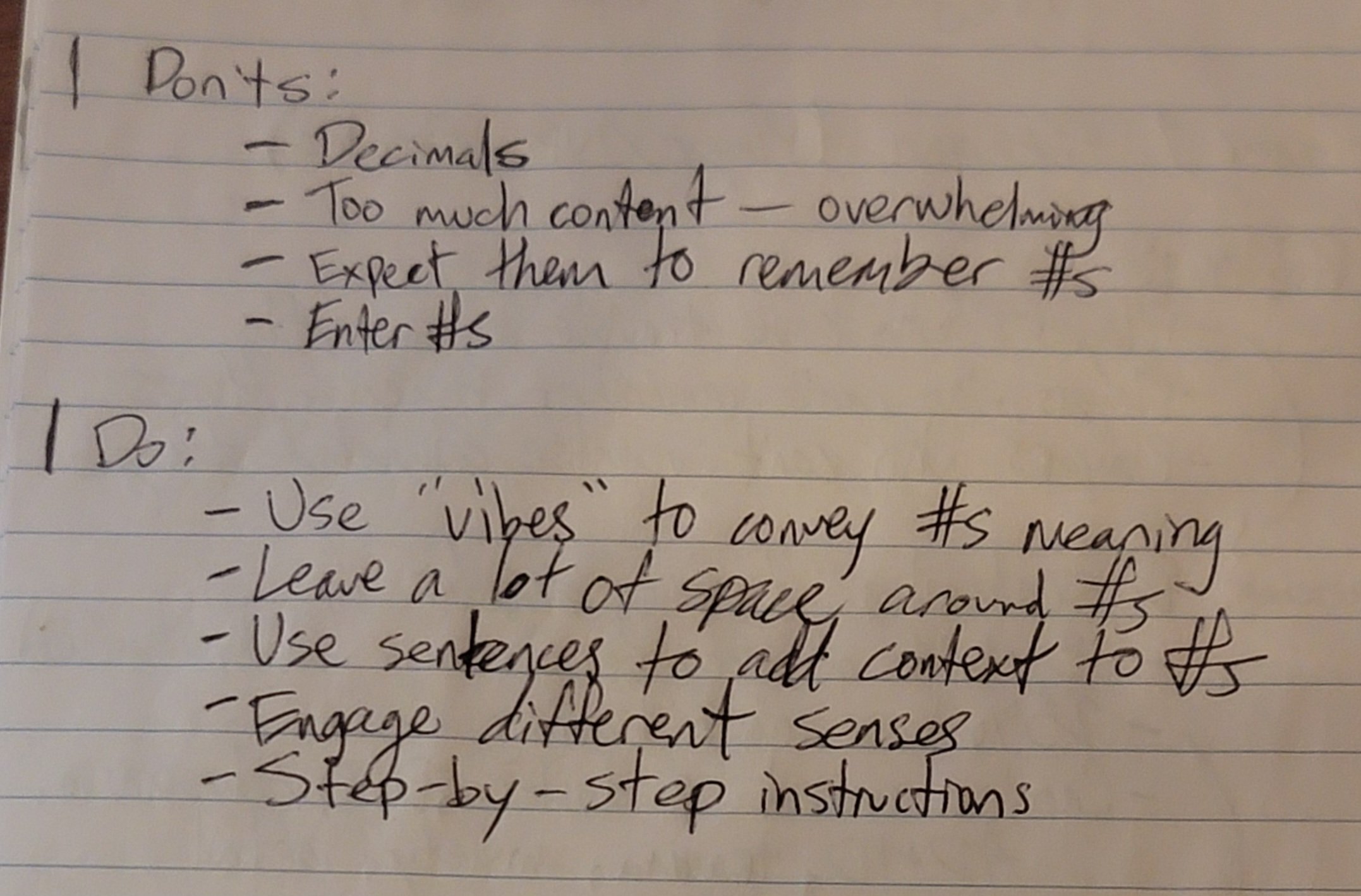
The “Do”s and “Don’t”s
Through my research, I came up with a few quick tips for myself on how my accessibility feature should interact with the user…
“Do”s:
Use “vibes” to convey if a result is good or bad.
Leave space around any numbers.
Use sentences to give numbers context (helps with drawing connections to what numbers mean practically).
Utilize step-by-step instructions if numbers are necessary.
Engage different senses other than sight (if possible).
“Don’t”s:
Avoid decimals!
Too much content with numbers can be overwhelming.
Don’t expect the user to remember/recall numbers.
Don’t make the user enter numbers into a field.
So What Should Change?
With my research and audience clear, I identified what needed addressing in my design work…
Redesign the Battle UI/UX
a. Moves UI
b. Bars (specifically HP)
A New Number Accessibility Feature
This new accessibility feature I believe should act as a support to not just “play the game for them” but actually walk the player through how a turn is likely to play out given the variables (more on that soon).
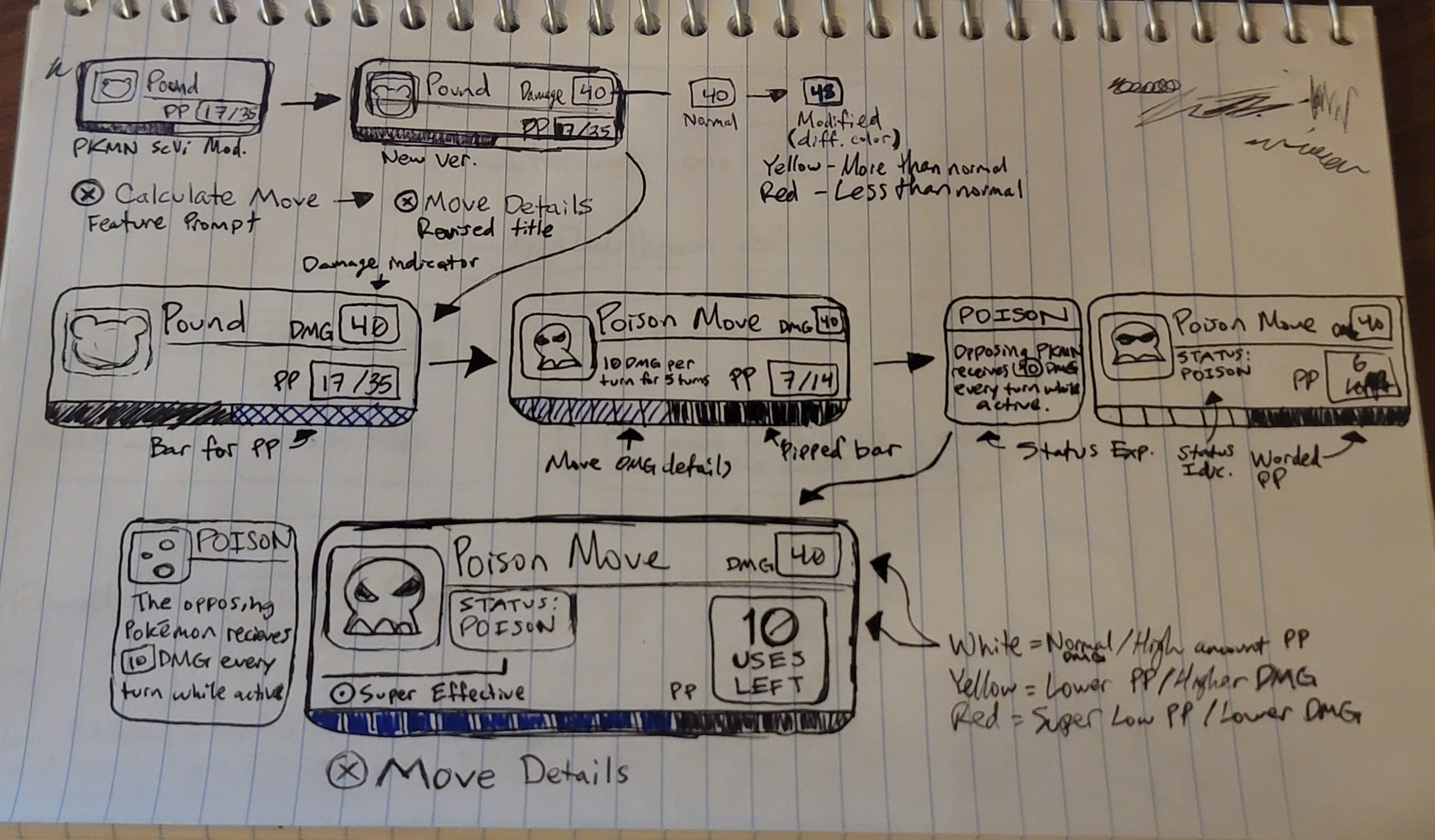

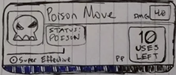
Redesigning the Moves’s UI/UX
In Pokemon, you tell your Pokemon to attack by selecting a move it knows. A move has a power, accuracy, and amount of uses it can be performed until it cannot be used again. Of course, this is all numbers-based.
Depicted on the side is a flow of my designs and iterations on how to improve the design and where I landed on. Here are some of the big details I created…
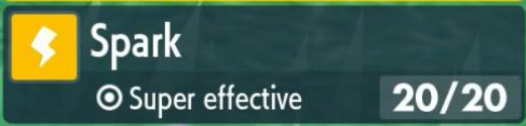
I decided early on that the damage a move would deal needed to be front and center. Players can forget damage between screens (in the normal game, you can press a button to see selected attack’s damage).
PP (what Pokemon depicts a move’s “uses” is) needed should be super clear what it’s conveying. So “uses left” should give the number proper context as per my research.
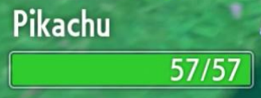
I also decided that PP should be also conveyed through a bar. A bar is much more tangible to see chip away than a fraction.
The uses bar will be discrete. As opposed to a more continuous look Pokemon games usually have, the bar will have visual segments that get chipped off with each use which should more usefully visualize how much of the move you have left.
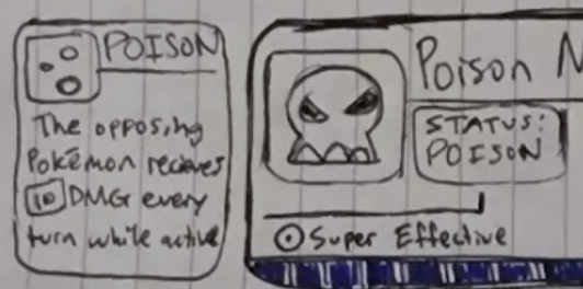
Moves that apply a status effect that could modify the move’s damage projection for the turn should be displayed with what it does somewhere handy.
Of course, all numbers depicted should be displayed with space around them. I used boxes around numbers to try and point them out clearly to the player and act as a sort of “spacer” between elements.
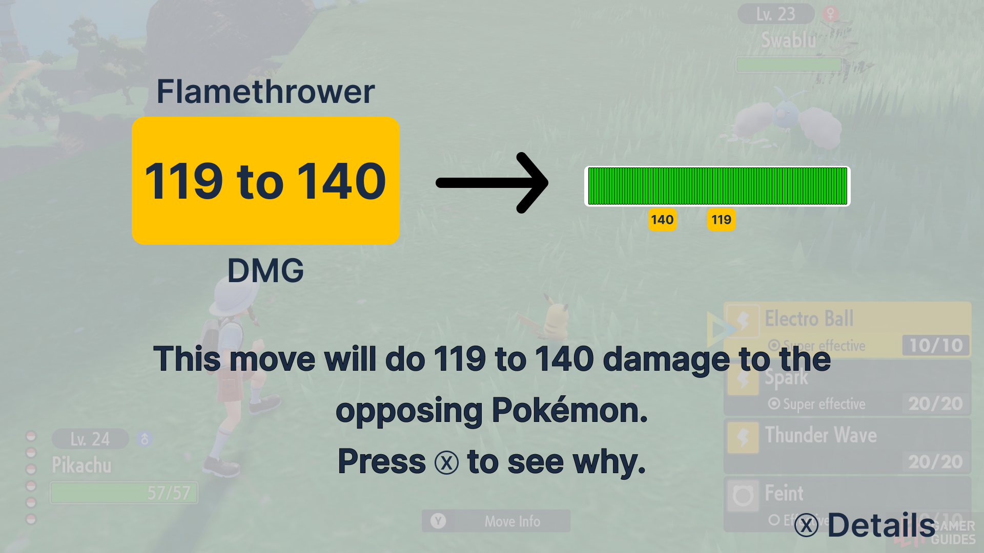
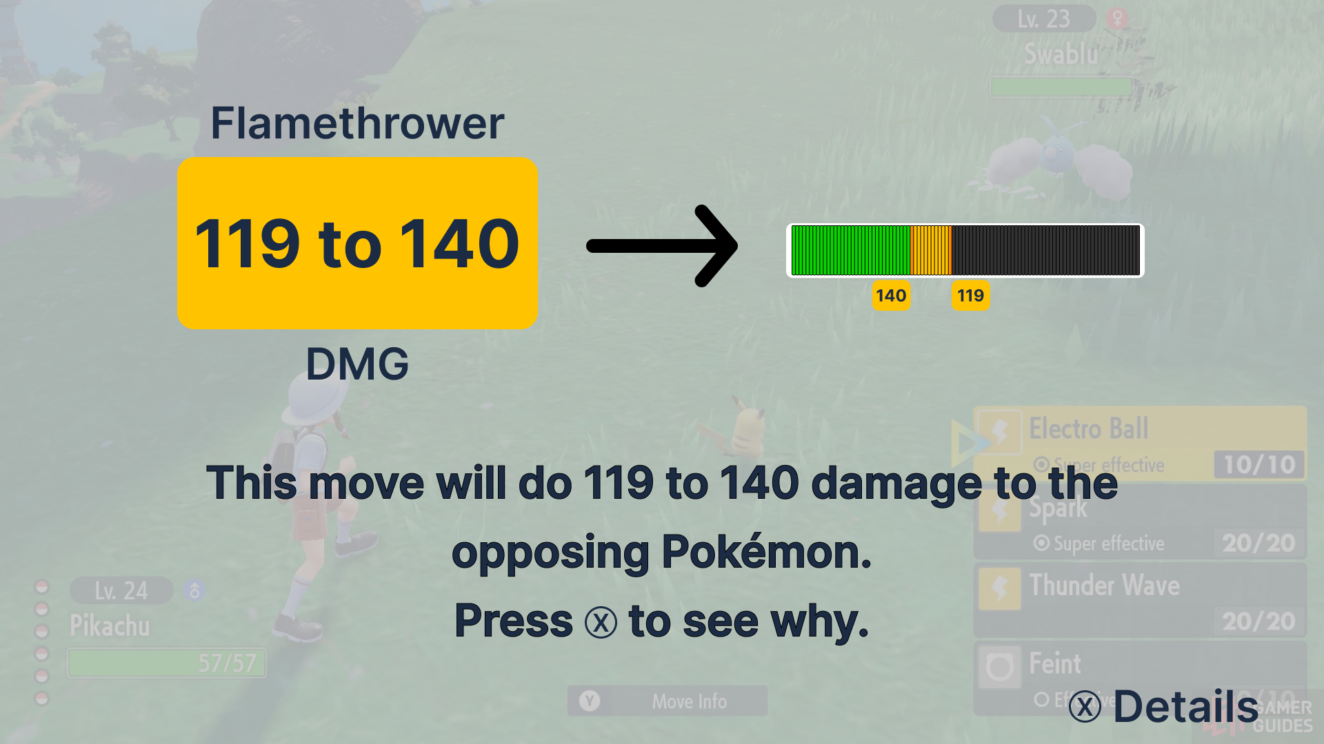
Redesigning the Bars’s UI/UX
In Pokemon, bars are usually depicted as a solid bar that drains a certain percentage when taking damage or healing. In my iteration, all bars have distinct “pips” in them so a player can more accurately determine how much “X” damage would take from the bar.
This change was reflected in the moves’s changes but thought to mention it more specifically here as it is a very holistic change.
A New Assist Feature Proposal
My completely new feature would come in the form of an additional accessibility assist feature. Here’s a brief overview of how it works…
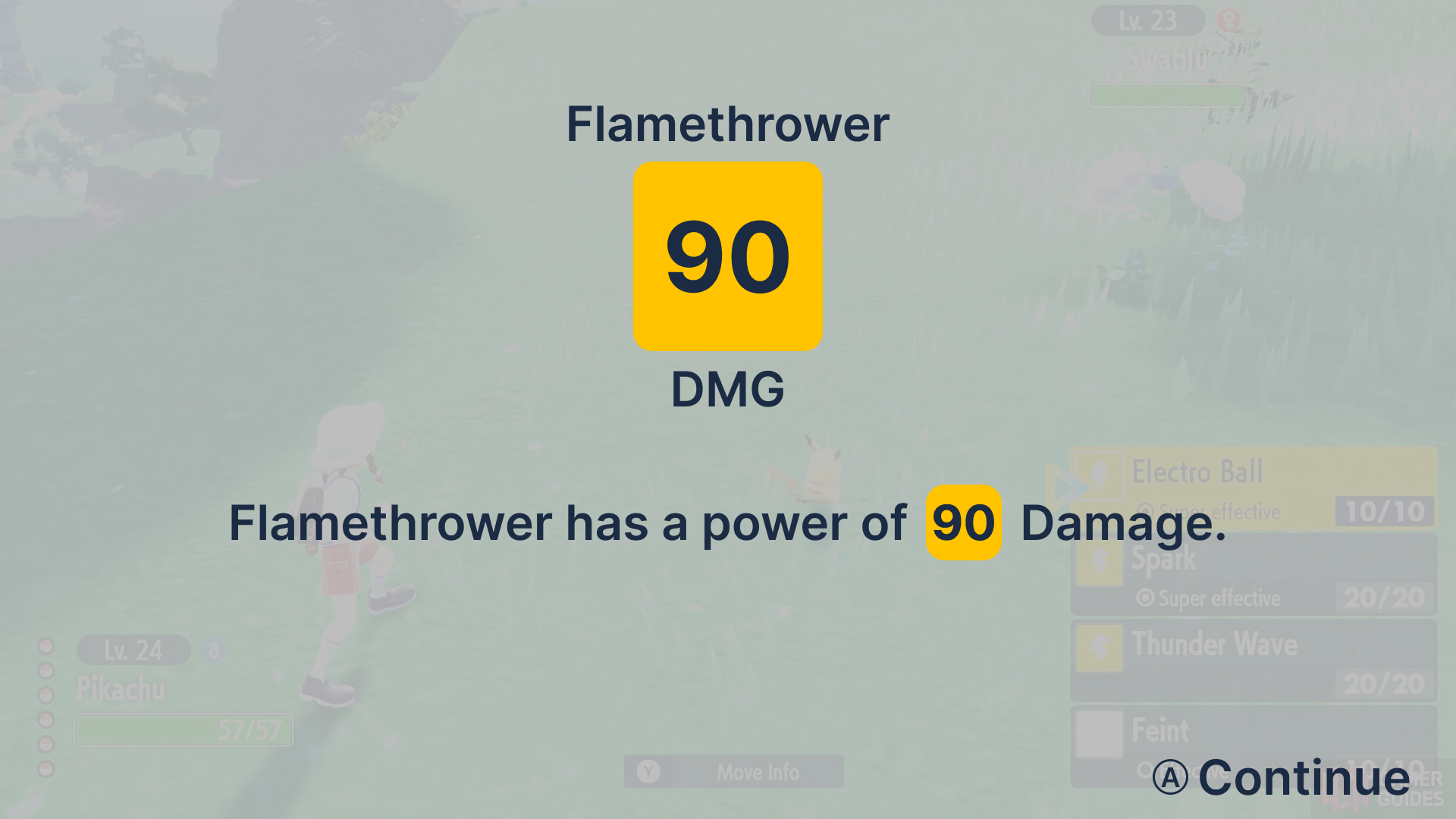
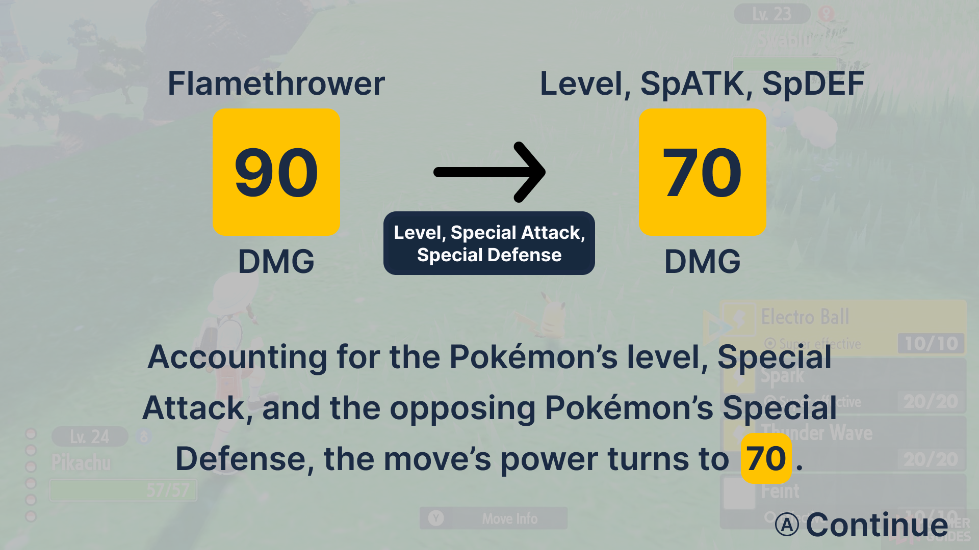
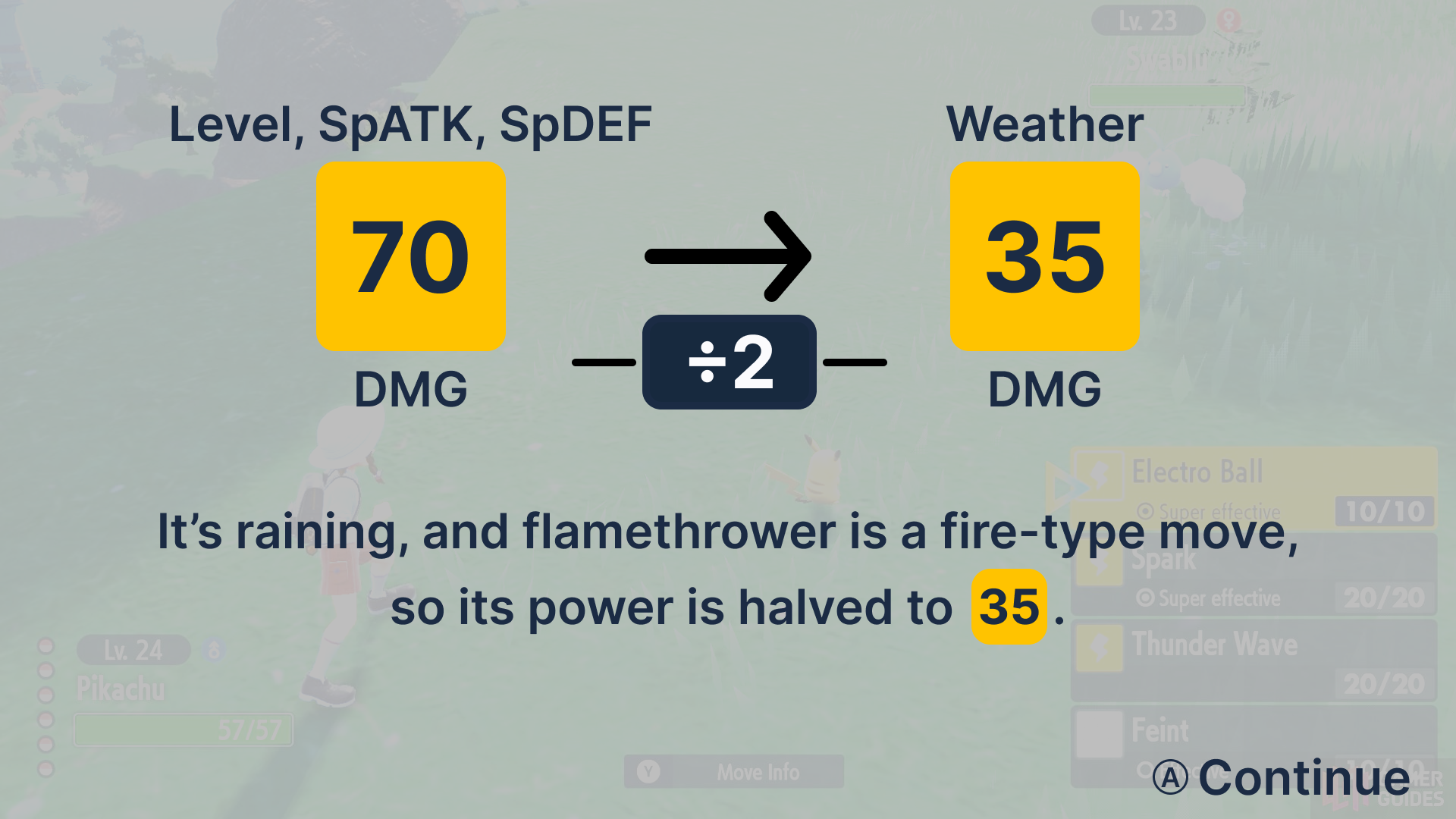
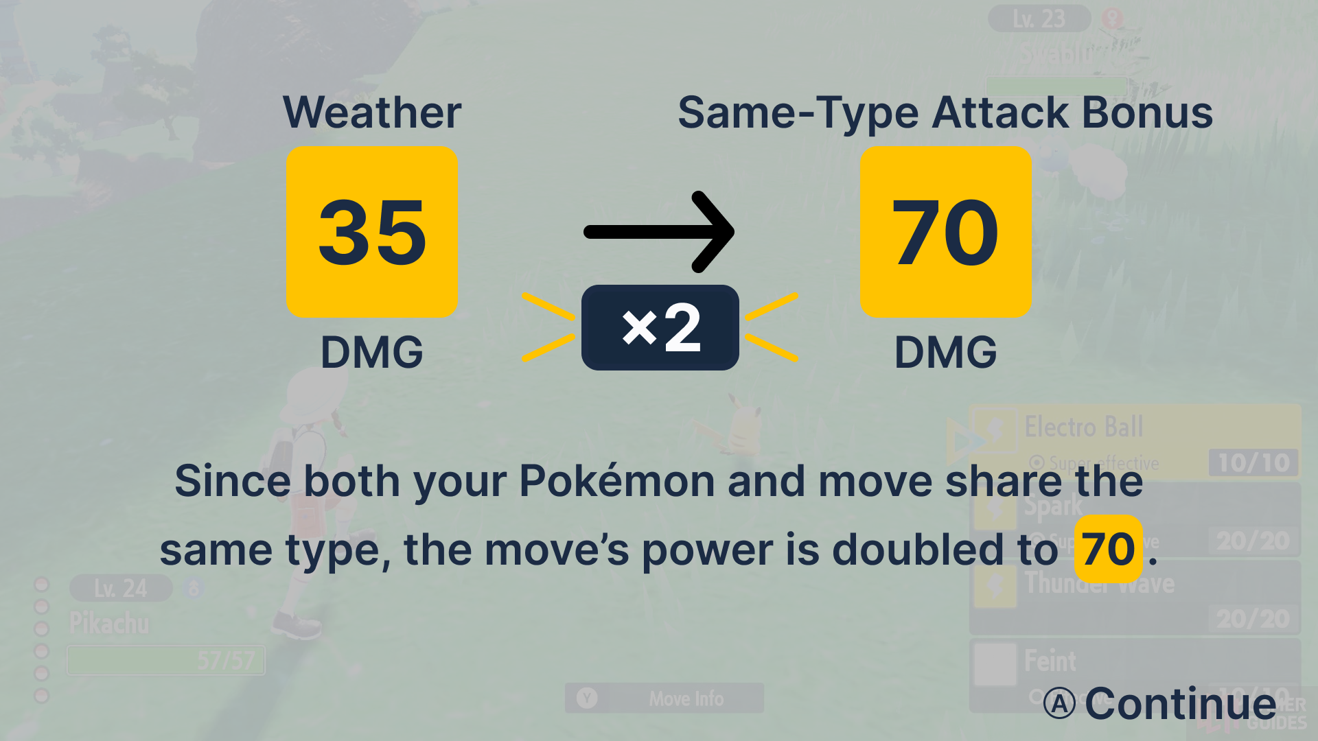
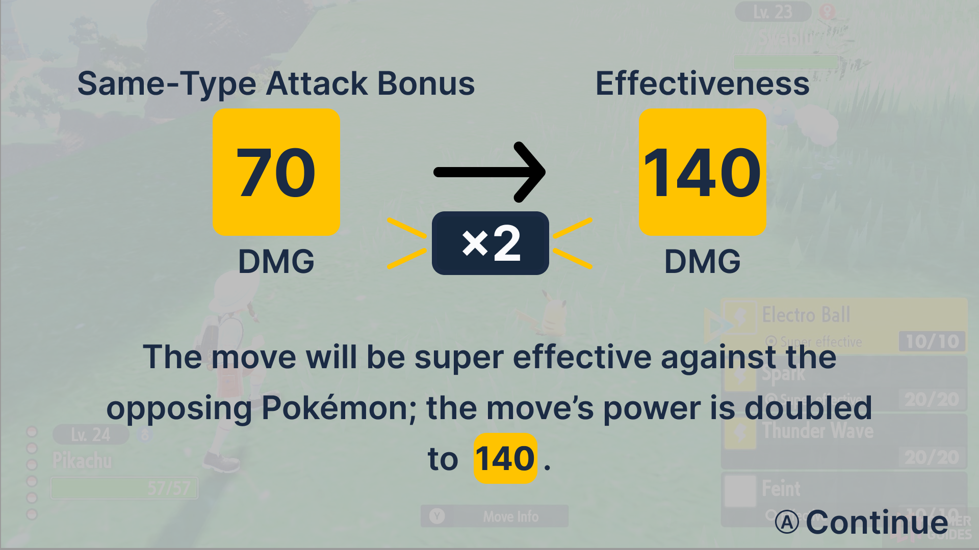
When in battle, while hovering over a move, press the X button to bring up the “Assist” screen (or as I call it, the “Move Details” menu).
It will show a basic overview on how much damage the move is likely to do given the battle’s current state. Complete with an animation.
A player may then exit the screen from there and complete their turn. If, however, they wish to understand the calculations behind it, they may press X.
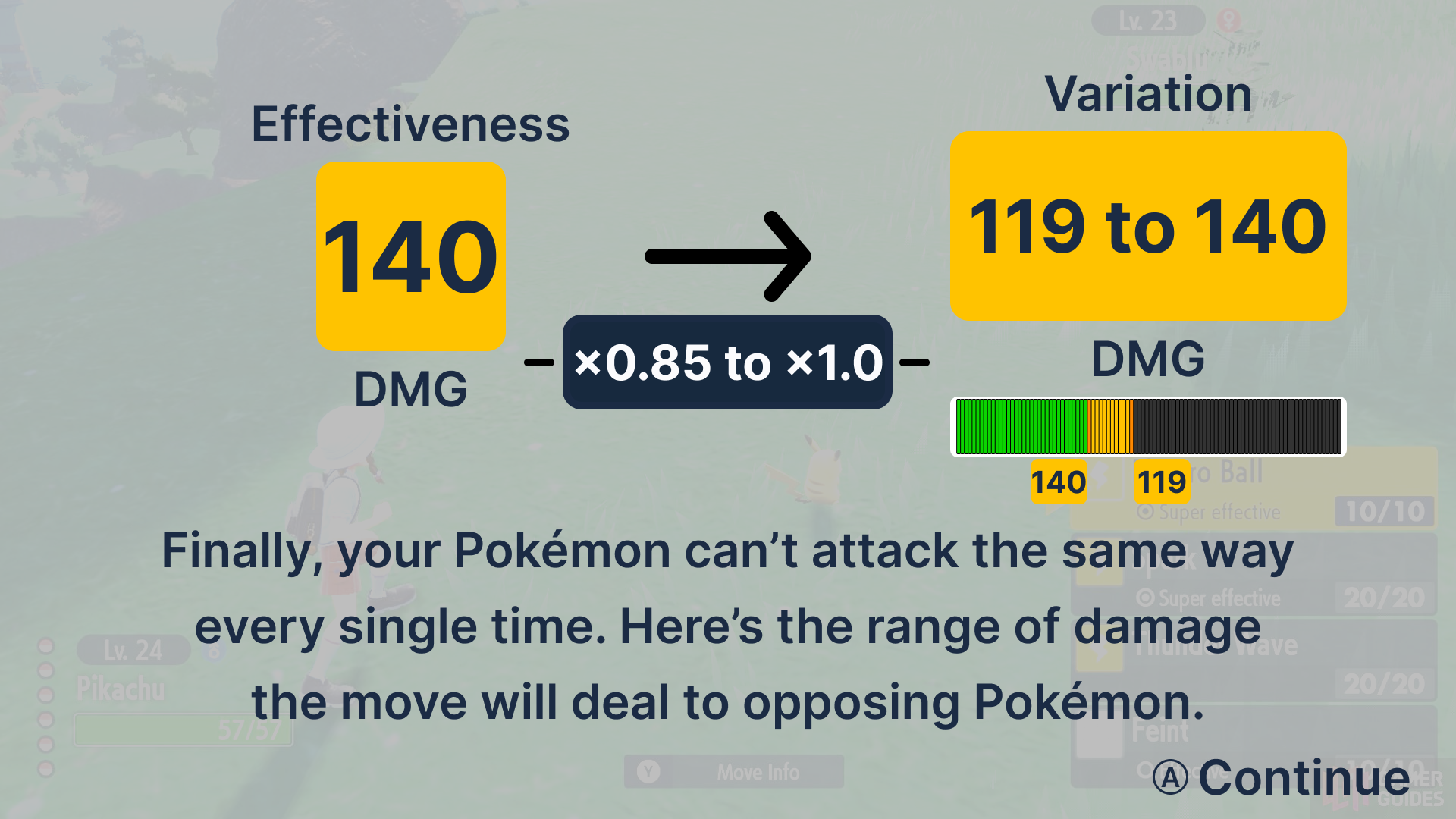
This will bring up a step-by-step screen-by-screen quick explanation of the factors that went into the damage. This considers modifiers that many math-challenged people may overlook (such as stats, weather, and STAB).
Finally, it will display and restate the projected minimum-maximum range the move will do (since moves have a built-in randomness to them).
How Does This Help?
This feature provides the ability for everyone (even people who do not have difficulty with numbers) to be able to perform these “turn projections” even if they involve math.
With a quick press of a button, a player may see how much the move is likely to do–an ability many players who can project their turns themselves can do quite reliably. Not only that, it lends the possibility for them to learn how to possibly perform these projections more reliably in the future with step-by-step instructions!
With this feature, it ensures a vastly greater number of players of varying ages and mental ability can be on even footing as those who can perform these mental calculations at speed and enjoy the games to a similar degree and even together!
Reception
The reception/feedback I received for this project was absolutely shining. I’m not one to brag, but boy did this make my day to read (especially from someone I really respect!)
Reflection
When I was finished with this project, I admittedly felt a little silly. “Does a simple game like Pokemon really need accessibility features?”. But to that I reiterate: of course! The mindset that even simple games for children shouldn’t also be taken to the same level of consideration as other aspects or media we have is silly. These might not be revolutionary features in a vacuum, but it says something when such features like this are not the standard, right?
Wanna Take a Read?
I go into MUCH more detail in the actual paper; I recommend it!